
Projects
About
M1+ APP
Improving app experience with a focused approach
A systematic approach to identifying and resolving customer pain points in our mobile app.
Design Lead
Agile
Leadership
Product design
UX audit
UX research
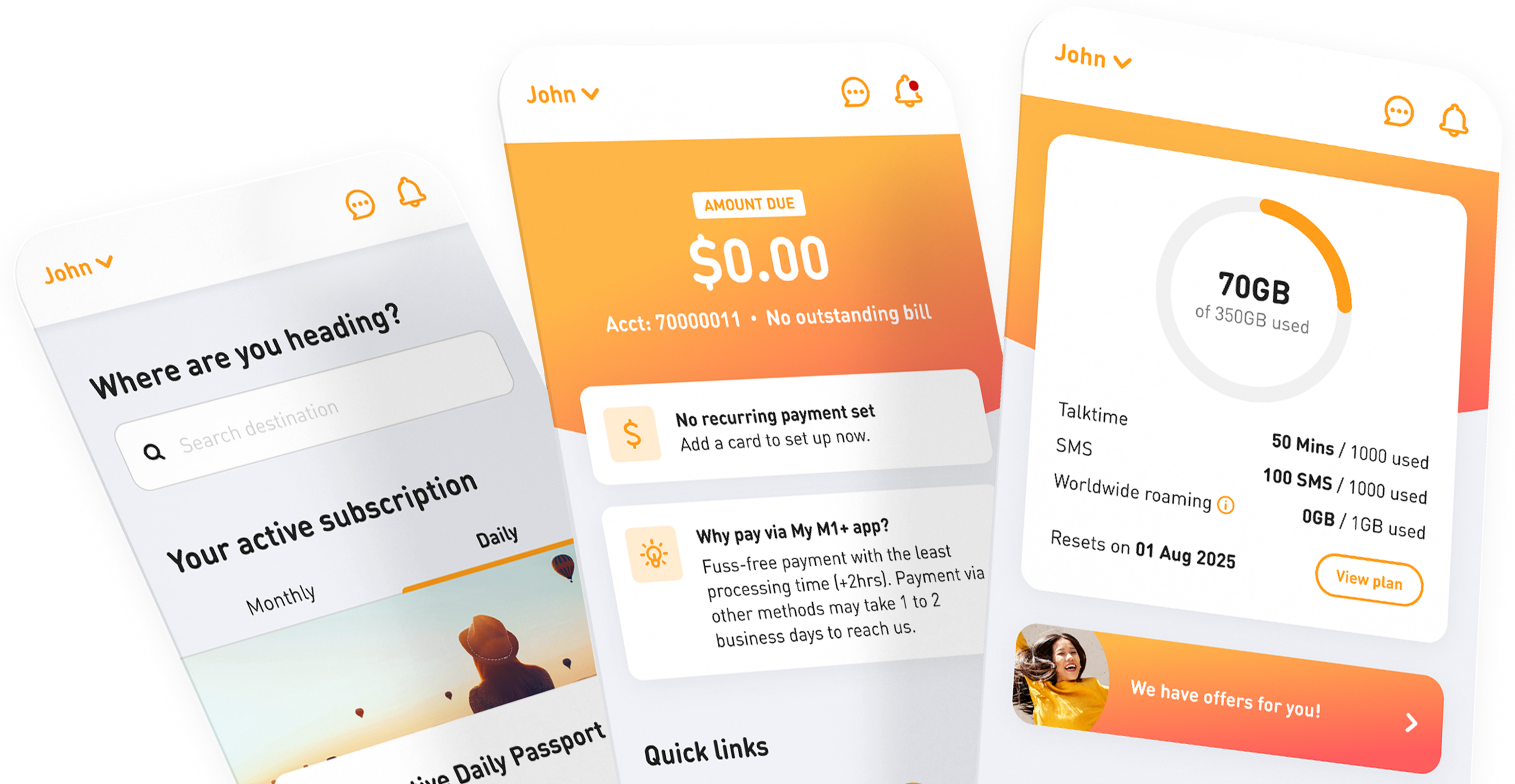
The problem
Our users were unhappy with their experience in the app, which came through in the NPS score and the verbatims.

Some UI elements weren't intuitive
Add-ons and subscription flows were confusing
Navigation gave users no sense of where they were
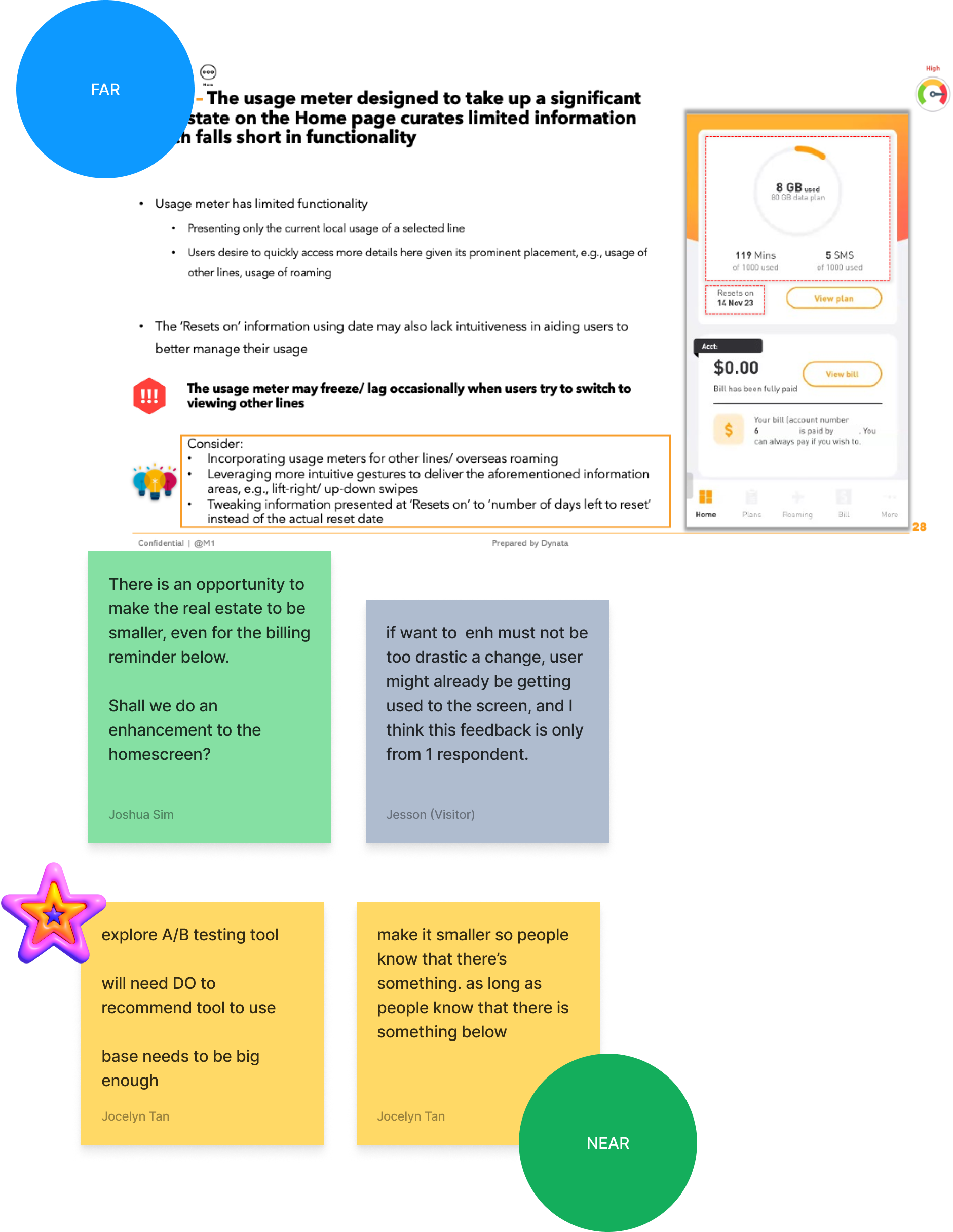
Narrowing the focus
We ran a UX audit and user interviews to give us a clearer picture of user needs and pain points.
Then a prioritisation exercise with stakeholders to determine which features were crucial to fix first and which could be moved to the backlog so users would see improvements sooner than waiting for a full overhaul.
We agreed to focus on the most visited “Bills” first, where users check bills and make payments.
Billing benchmark study
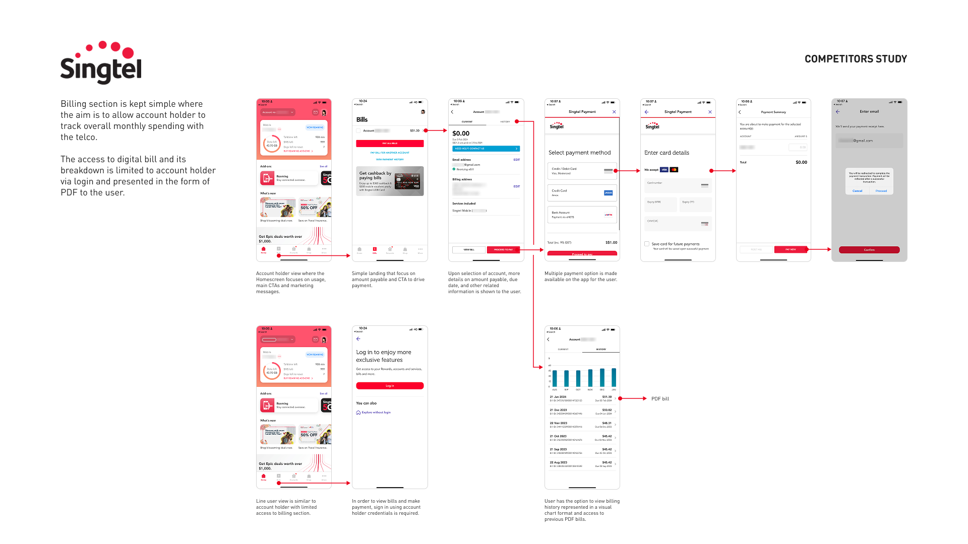
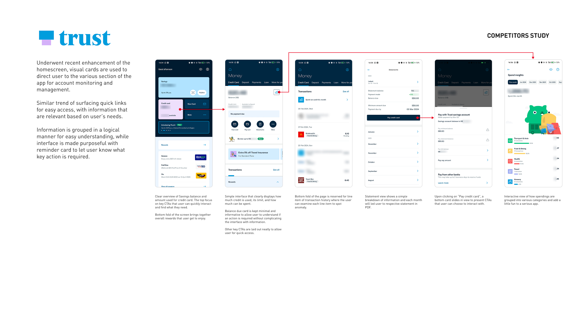
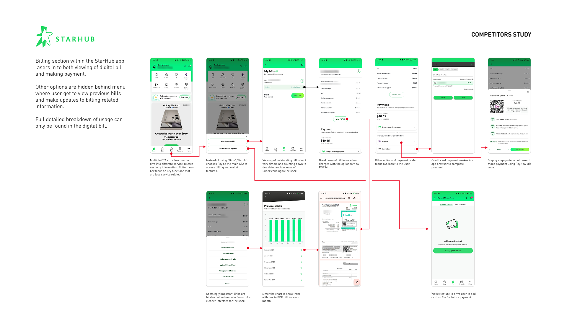
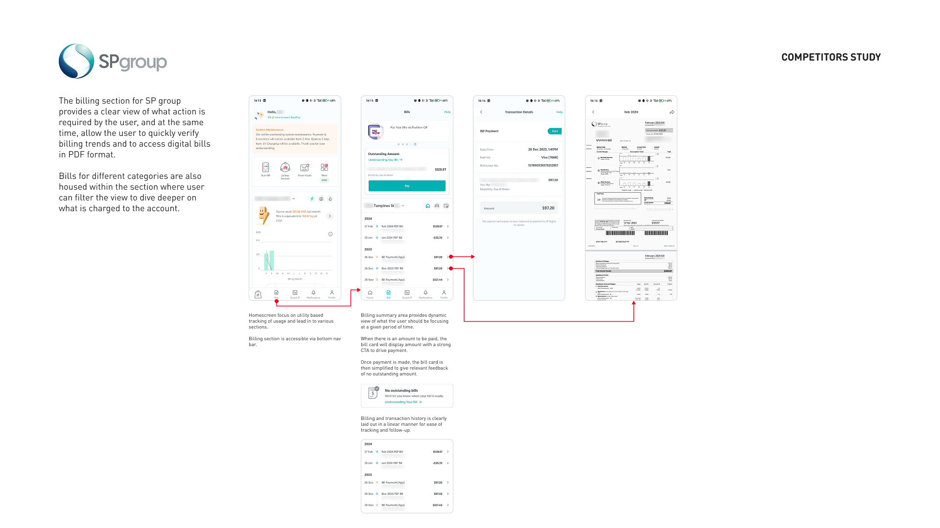
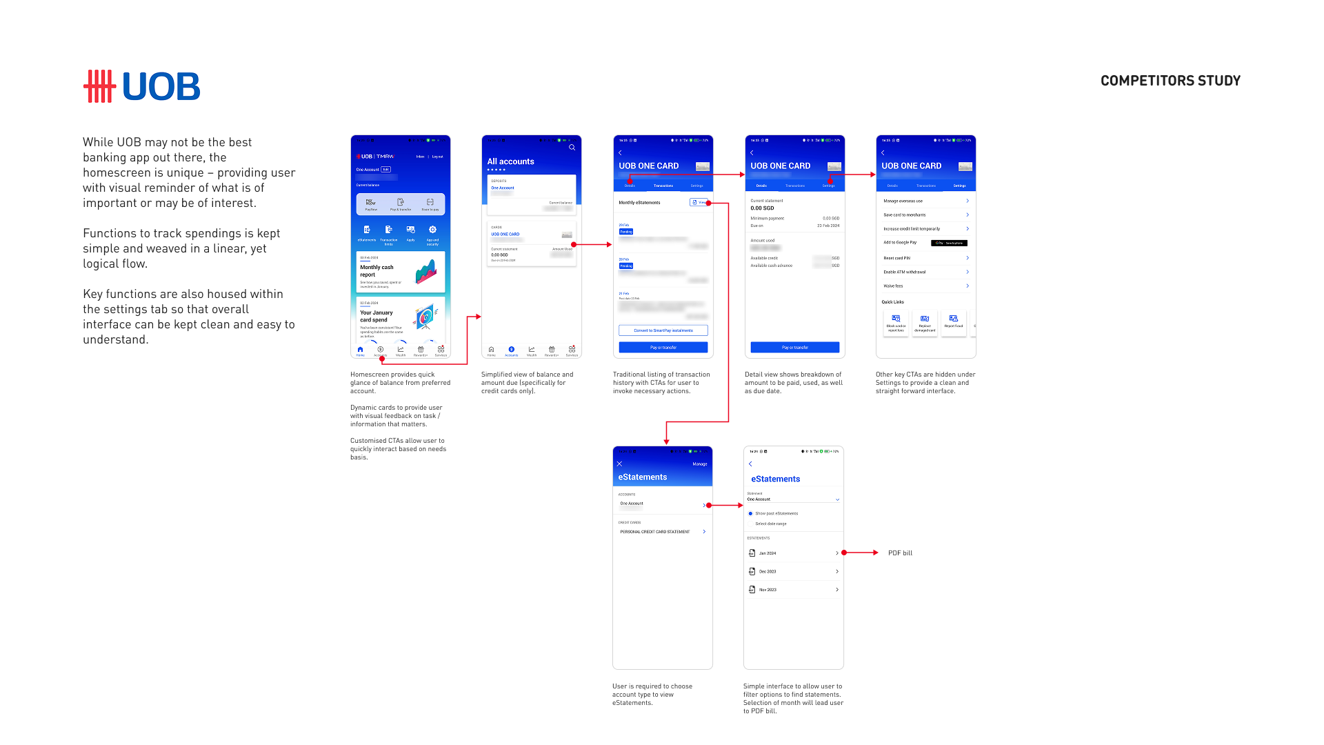
Desk research was conducted on the billing sections of five utility and finance apps to guide the redesign, and to set a baseline for quality and features.
Key findings:
•
Focus on viewing bills and making payments.
•
Simple and straight-forward without over-informing.
•
Only surface key CTAs whenever necessary.
•
Let the PDF bill be the only source of truth.
Our objectives:
•
Focus on customer’s needs.
•
Provide clarity and assistance.
•
Timely reminders and not over-informing.
•
Accuracy to instil confidence and trust.
New design for Bills
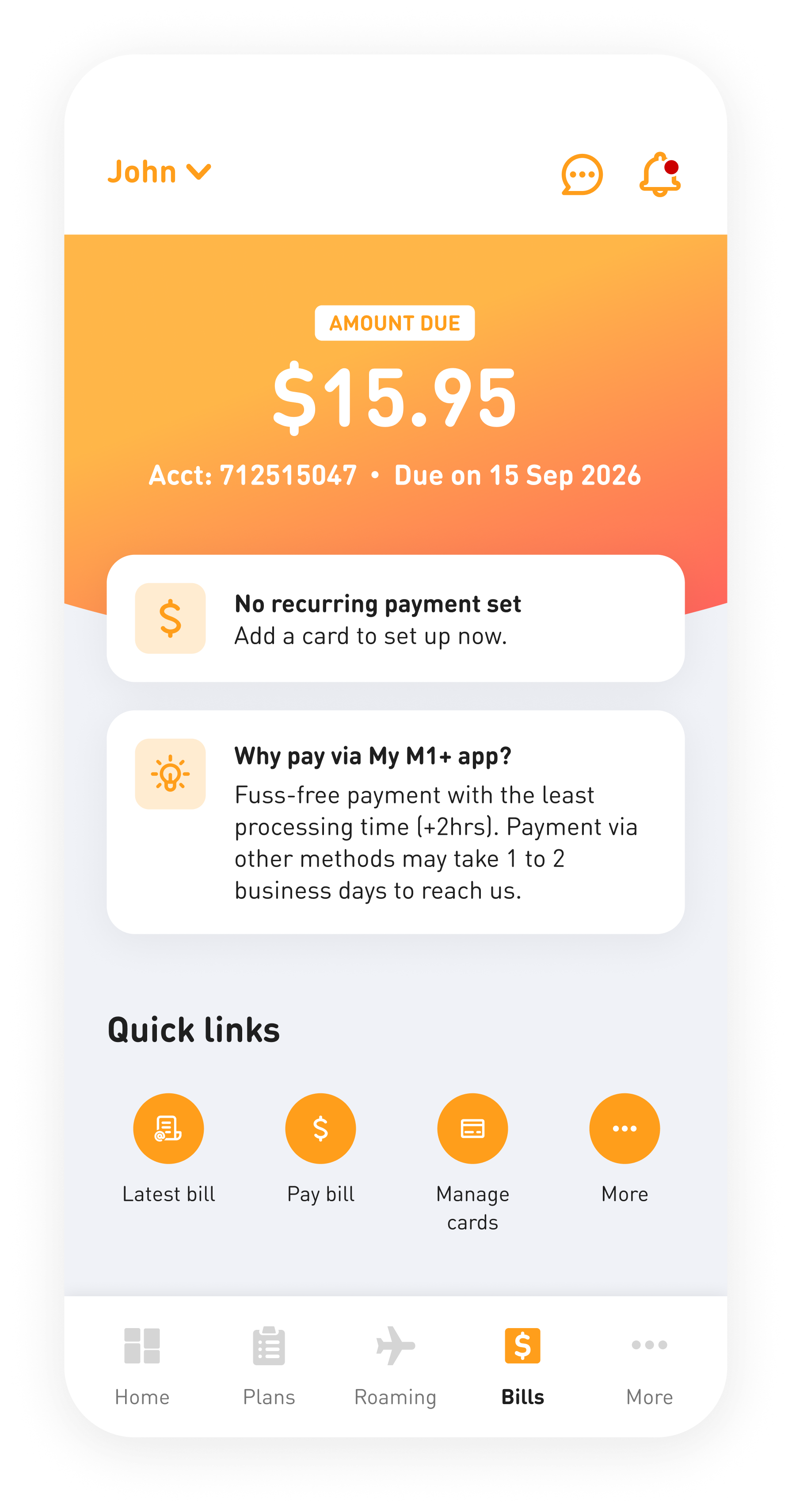
The Bills section needed a clearer way of showing information to the users. Revamp was done incrementally because backend constraints limited what could change, and a sudden overhaul would have meant users relearning the section they visit most.
It was also important to improve the experience while maintaining our design language so it felt like part of the app.
New
Old

1
2
3
4
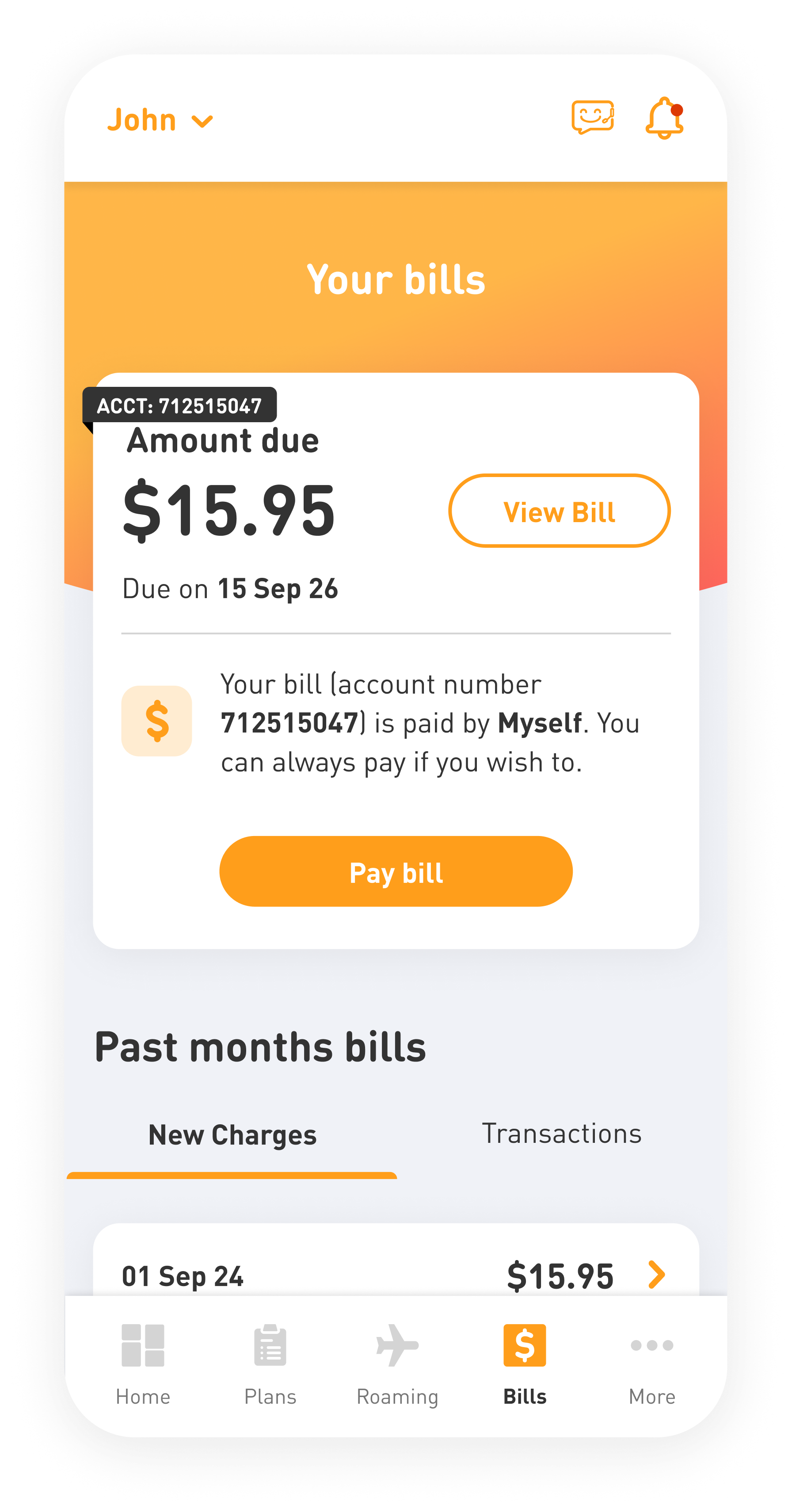
- Amount due was moved to the top, with account number and due date below. Previously it competed with a "View Bill" button and a paragraph of text.
- Payment method status now has its own card, so users can see whether a recurring payment is set and add one if it is not. It used to sit inside a sentence with nothing to act on.
- A dynamic banner adapts to the user's situation, explaining things like payment processing times where they matter.
- Quick links also give users a direct route to a list of options for them to complete the tasks they came to do.
- Microcopy was rewritten throughout so it is more user friendly. The old text mainly spoke from the system's point of view, not the user's.
Ongoing enhancements
Alongside the bigger redesigns, smaller improvements came out of the NPS verbatim and went into sprints as capacity allowed. Roaming was one of the areas we worked through.
New
1
2
3
What changed:
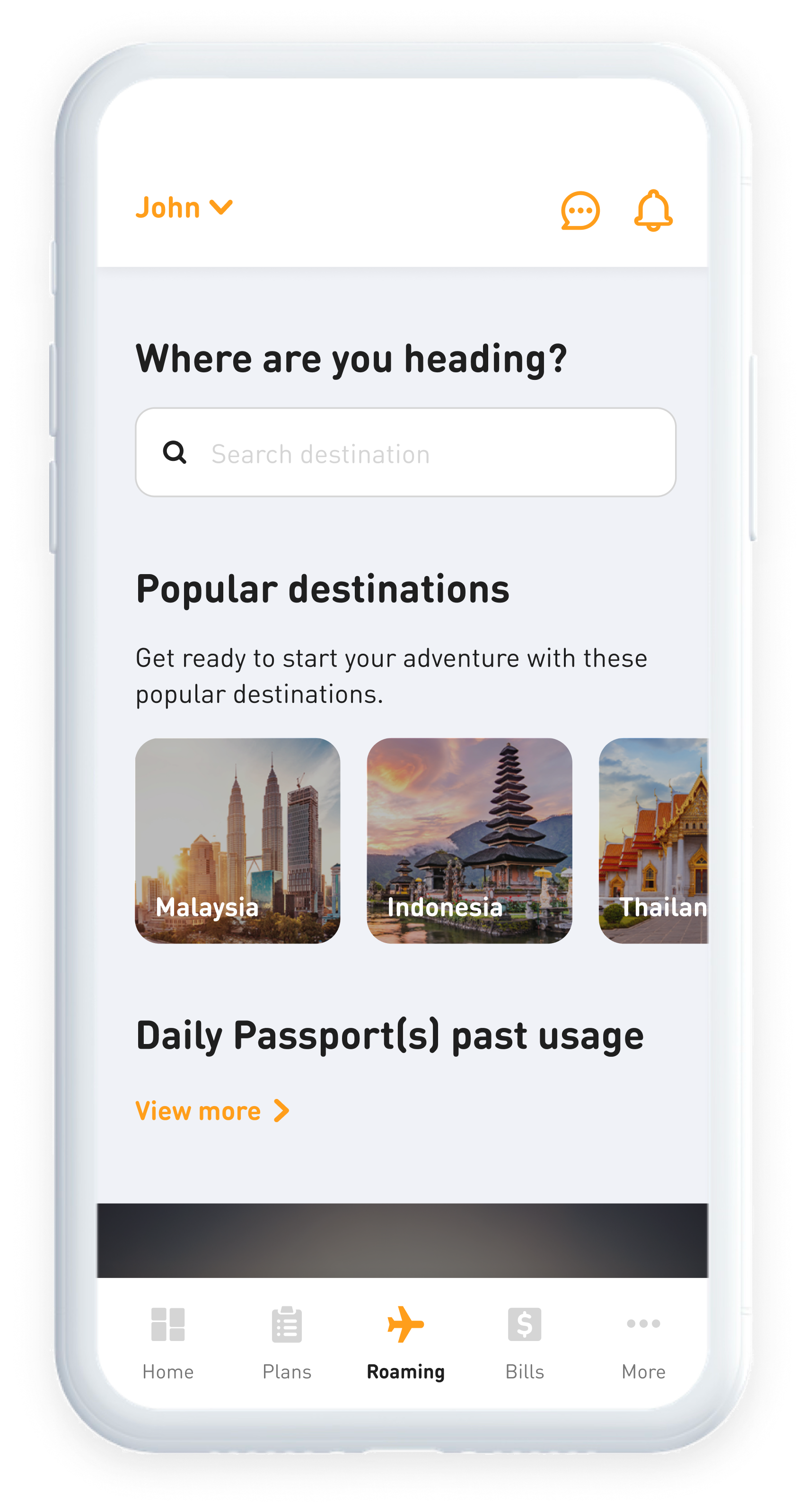
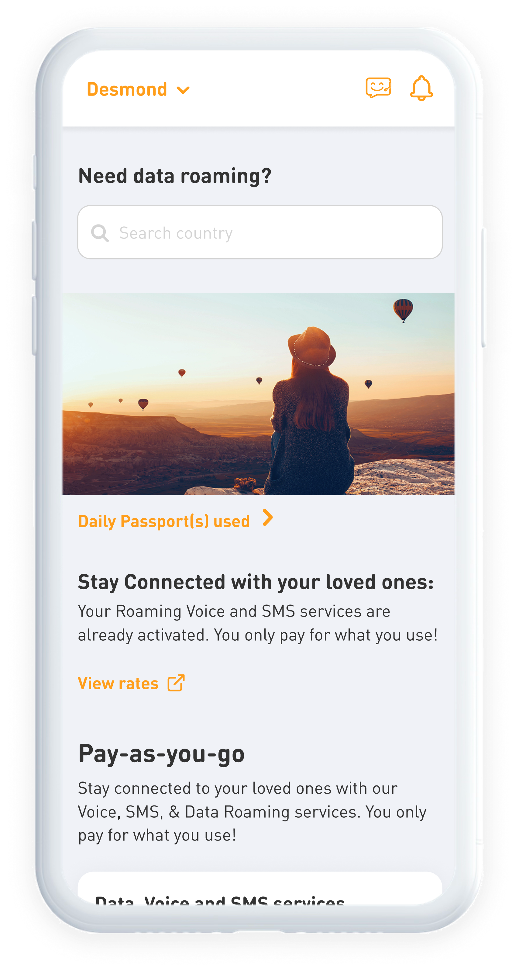
- The question at the top of Roaming changed from "Need data roaming?" to "Where are you heading?", so the section reads as the way users think rather than the way the product is named.
- Popular destinations were added below it, giving people a way to start discovery without typing.
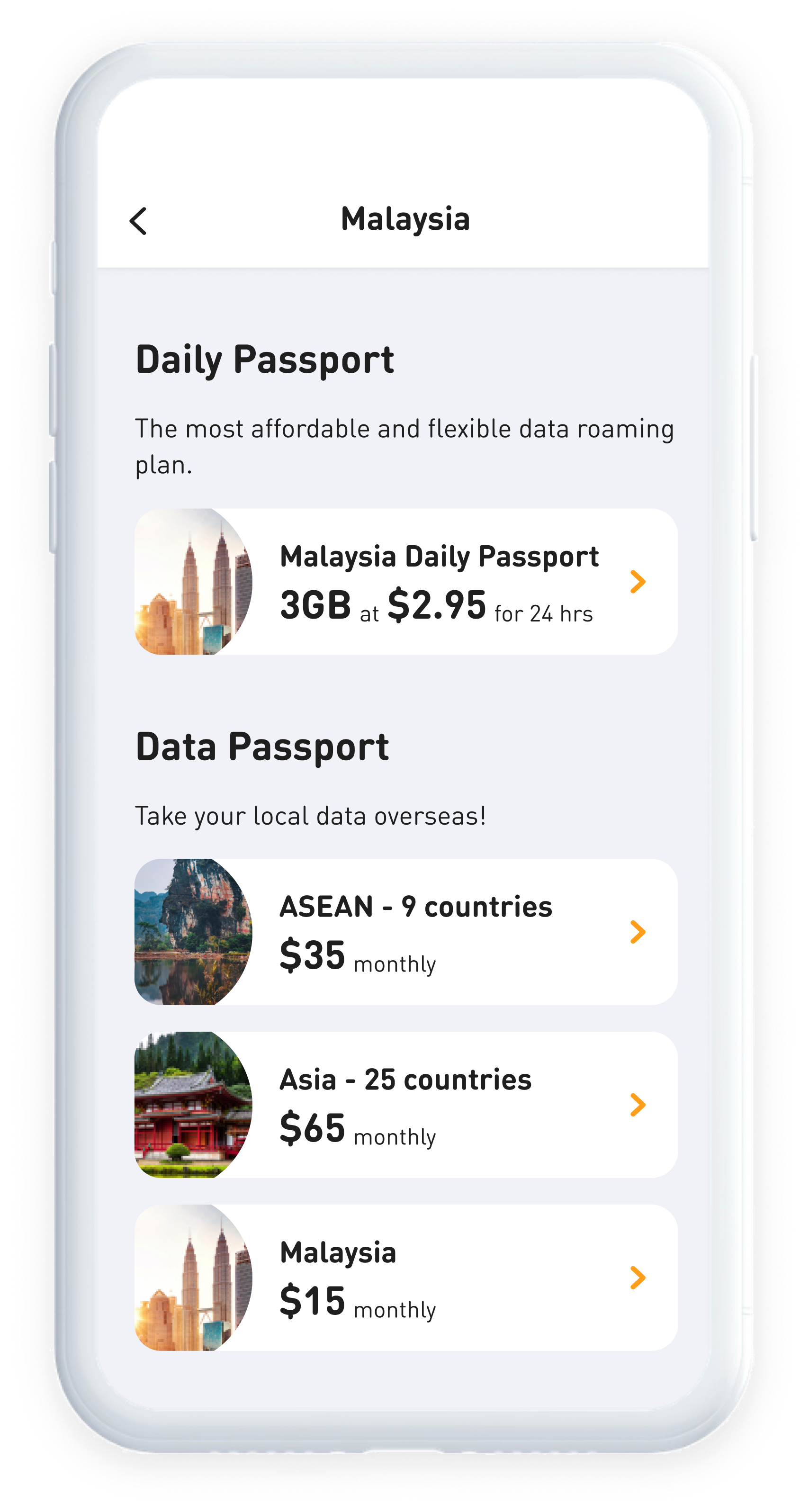
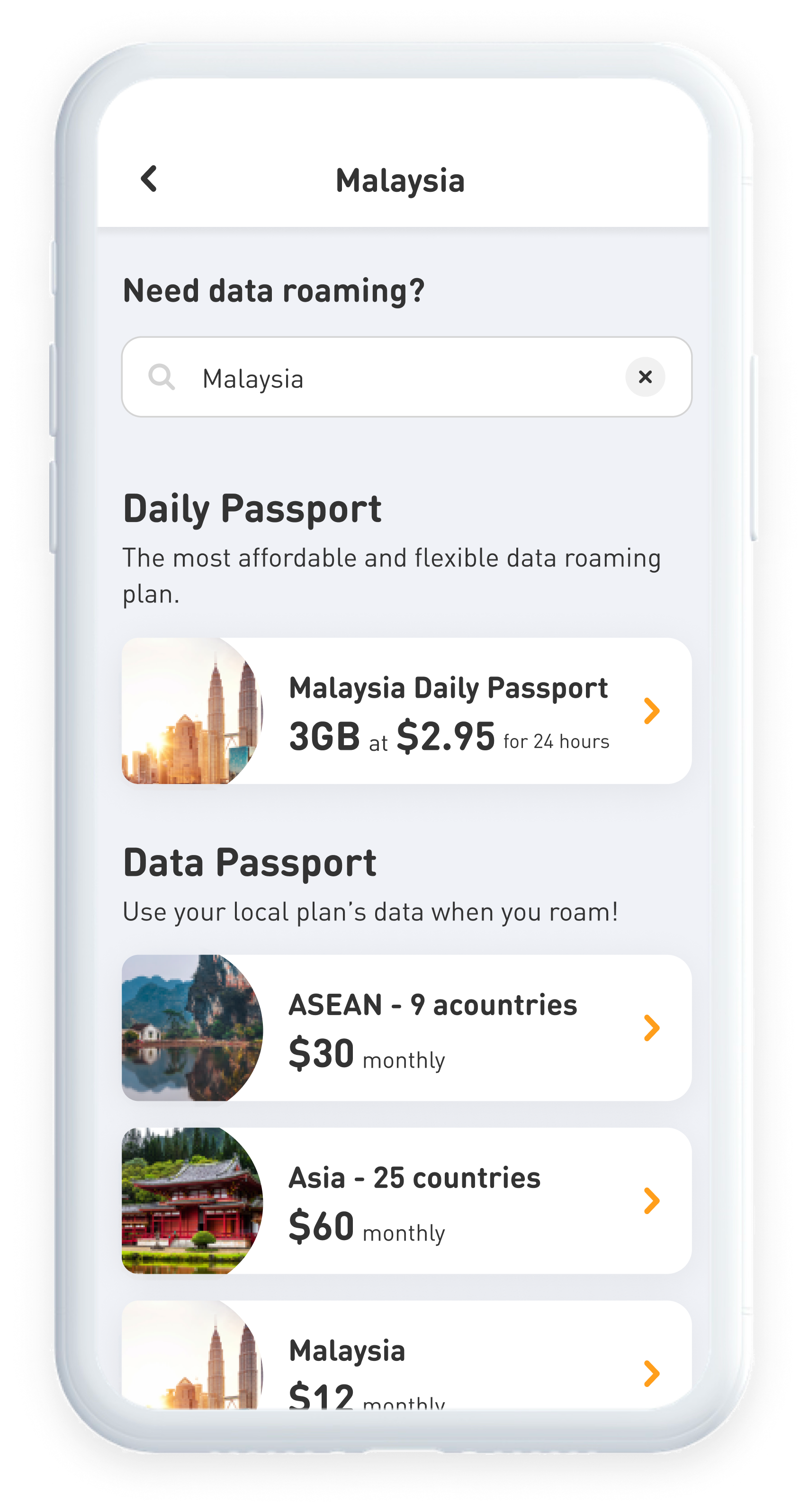
- The search bar was removed from the destination screen since the destination name was already in the header.
From fixing to delighting
People open a telco app to subscribe to add-ons or pay a bill, then they leave. So we made the decision to use seasonal moments like M1's anniversary, National Day and Christmas to create a human connection through the app icon and splash screen.
Each refresh was designed and animated in After Effects then exported as JSON for development.




Exploring a scalable plan card
During the enhancements, I also explored a few directions for the home screen plan card.
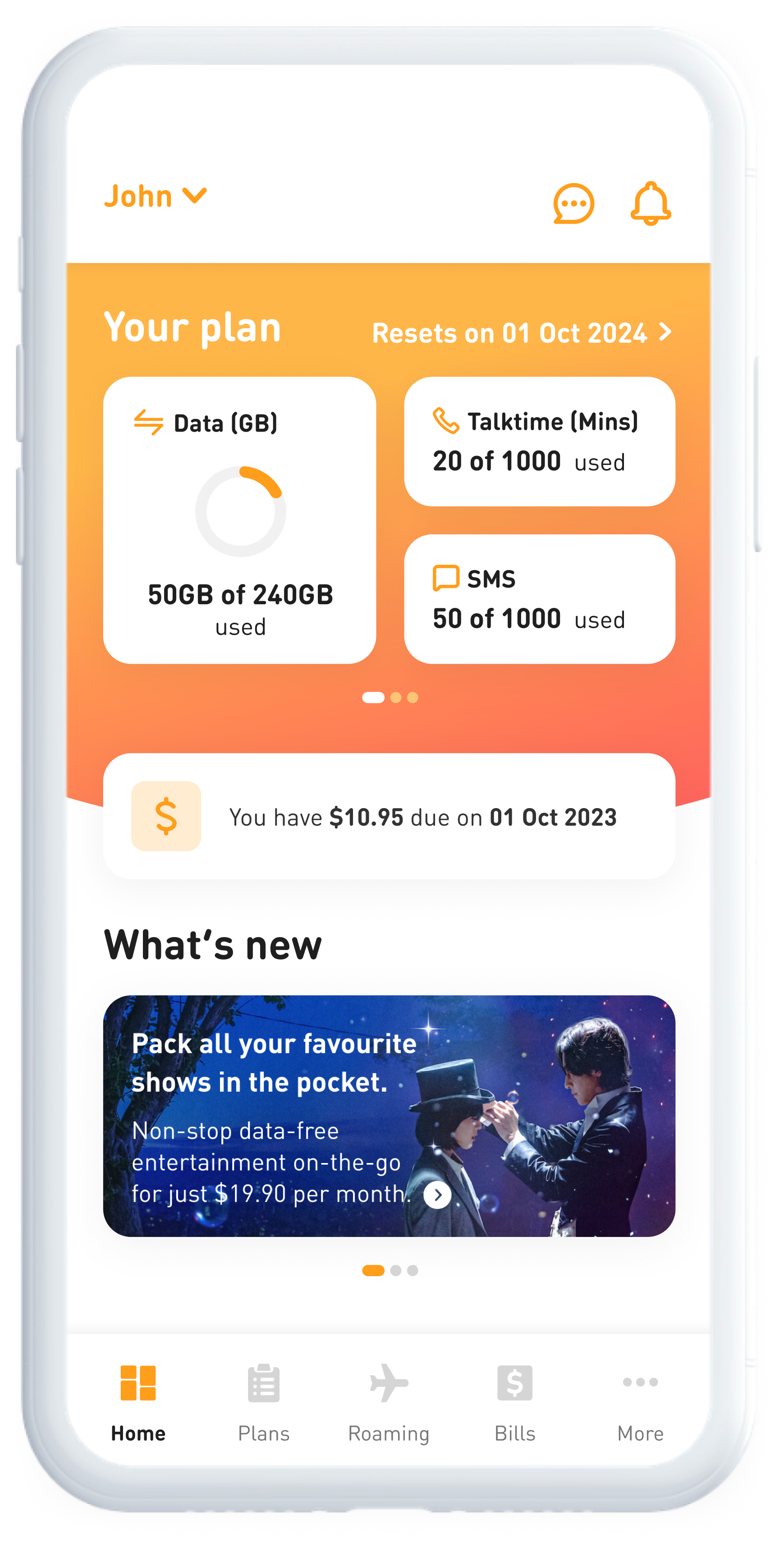
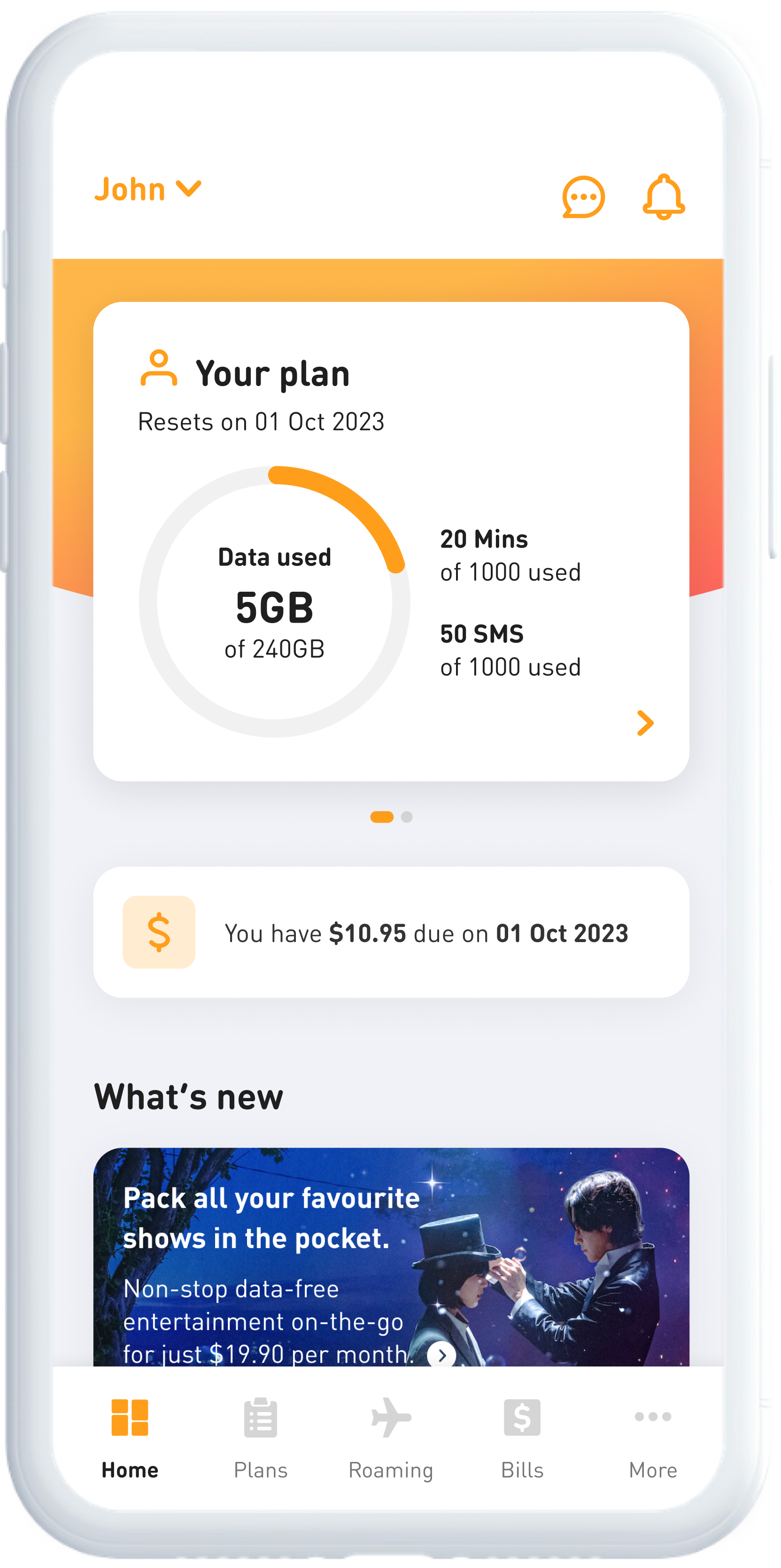
The existing design was built to show a fixed set of things: data, talktime, SMS. Whenever the business added a new entitlement to keep up with the market, there was nowhere good to put it, and the card got more cluttered.
From the explorations, I shortlisted two options to start the conversation with stakeholders:
Bento grid
•
Smaller containers help to cluster different information without cluttering the screen.
•
Clearer visual hierarchy and allows fast scanning of information.
•
Requires more effort to build.
Swipeable cards
•
Kept the existing structure but reduced the card height by 30%.
•
Non-plan entitlements were moved into their own card, giving more room to the content below.
•
Minimum impact to current logic.
Stakeholders loved the swipeable cards option more. However, it's parked for now as it required further assessment with tech and budget allocation.
After a year of enhancements
M1+ app NPS moved from

38.5
to an all-time high of

28.3
What’s next

Validating the changes
The redesign was informed by the audit and interviews, but hasn't been tested with users since shipping. Usability testing on the new flows would confirm whether the changes hold up in practice, and catch anything the NPS movement isn’t showing.

Working through the backlog
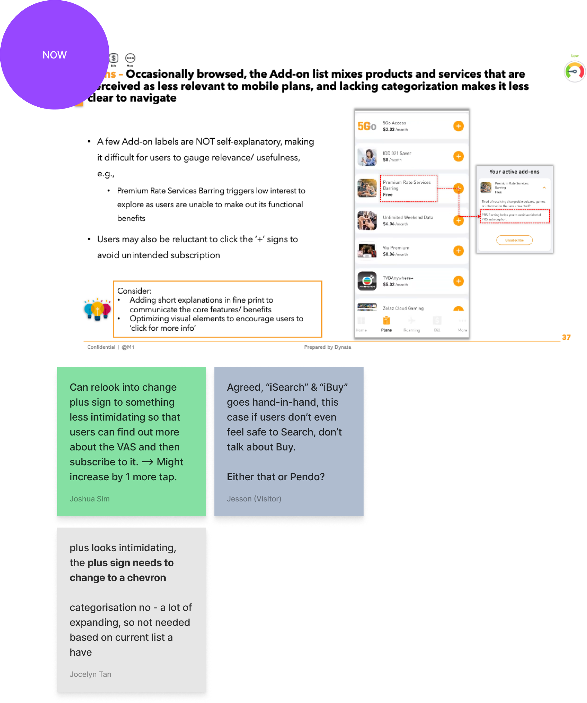
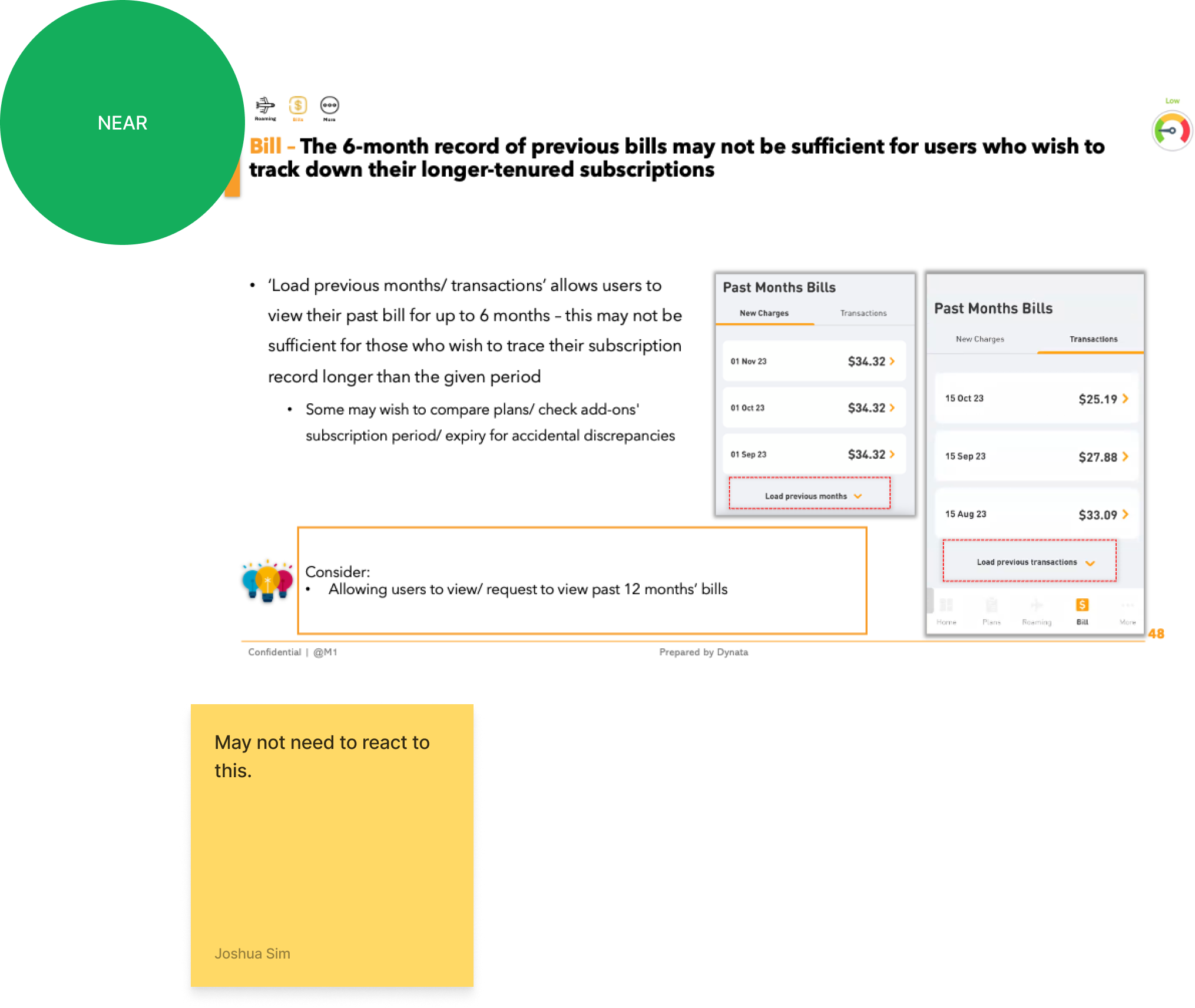
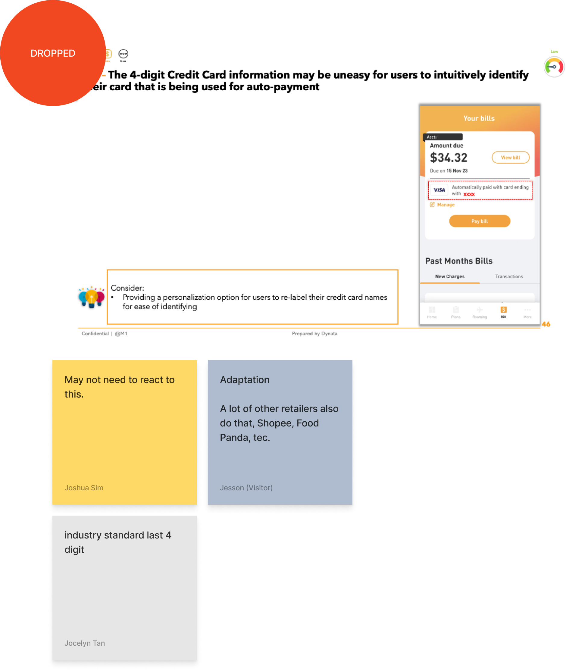
The prioritisation exercise sorted findings into what we'd fix now, near and far. The rest are still queued and should be picked up as capacity allows.
Projects
About
M1+ APP
Improving app experience with a focused approach
A systematic approach to identifying and resolving customer pain points in our mobile app.
Design Lead
Agile
Leadership
Product design
UX audit
UX research
The problem
Our users were unhappy with their experience in the app, which came through in the NPS score and the verbatims.
Some UI elements weren't intuitive
Add-ons and subscription flows were confusing
Navigation gave users no sense of where they were
Narrowing the focus
We ran a UX audit and user interviews to give us a clearer picture of user needs and pain points.
Then a prioritisation exercise with stakeholders to determine which features were crucial to fix first and which could be moved to the backlog so users would see improvements sooner than waiting for a full overhaul.
We agreed to focus on the most visited “Bills” first, where users check bills and make payments.
Billing benchmark study
Desk research was conducted on the billing sections of five utility and finance apps to guide the redesign, and to set a baseline for quality and features.
Key findings:
•
Focus on viewing bills and making payments.
•
Simple and straight-forward without over-informing.
•
Only surface key CTAs whenever necessary.
•
Let the PDF bill be the only source of truth.
Our objectives:
•
Focus on customer’s needs.
•
Provide clarity and assistance.
•
Timely reminders and not over-informing.
•
Accuracy to instil confidence and trust.
New design for Bills
The Bills section needed a clearer way of showing information to the users. Revamp was done incrementally because backend constraints limited what could change, and a sudden overhaul would have meant users relearning the section they visit most.
It was also important to improve the experience while maintaining our design language so it felt like part of the app.
New
Old
1
2
3
4
- Amount due was moved to the top, with account number and due date below. Previously it competed with a "View Bill" button and a paragraph of text.
- Payment method status now has its own card, so users can see whether a recurring payment is set and add one if it is not. It used to sit inside a sentence with nothing to act on.
- A dynamic banner adapts to the user's situation, explaining things like payment processing times where they matter.
- Quick links also give users a direct route to a list of options for them to complete the tasks they came to do.
- Microcopy was rewritten throughout so it is more user friendly. The old text mainly spoke from the system's point of view, not the user's.
Ongoing enhancements
Alongside the bigger redesigns, smaller improvements came out of the NPS verbatim and went into sprints as capacity allowed. Roaming was one of the areas we worked through.
New
1
2
Old
What changed:
- The question at the top of Roaming changed from "Need data roaming?" to "Where are you heading?", so the section reads as the way users think rather than the way the product is named.
- Popular destinations were added below it, giving people a way to start discovery without typing.
- The search bar was removed from the destination screen since the destination name was already in the header.
3
From fixing to delighting
People open a telco app to subscribe to add-ons or pay a bill, then they leave. So we made the decision to use seasonal moments like M1's anniversary, National Day and Christmas to create a human connection through the app icon and splash screen.
Each refresh was designed and animated in After Effects then exported as JSON for development.















Exploring a scalable plan card
During the enhancements, I also explored a few directions for the home screen plan card.
The existing design was built to show a fixed set of things: data, talktime, SMS. Whenever the business added a new entitlement to keep up with the market, there was nowhere good to put it, and the card got more cluttered.
From the explorations, I shortlisted two options to start the conversation with stakeholders:
Bento grid
•
Smaller containers help to cluster different information without cluttering the screen.
•
Clearer visual hierarchy and allows fast scanning of information.
•
Requires more effort to build.
Swipeable cards
•
Kept the existing structure but reduced the card height by 30%.
•
Non-plan entitlements were moved into their own card, giving more room to the content below.
•
Minimum impact to current logic.
Stakeholders loved the swipeable cards option more. However, it's parked for now as it required further assessment with tech and budget allocation.
After a year of enhancements
M1+ app NPS moved from
38.5
to an all-time high of
28.3
What’s next

Validating the changes
The redesign was informed by the audit and interviews, but hasn't been tested with users since shipping. Usability testing on the new flows would confirm whether the changes hold up in practice, and catch anything the NPS movement isn’t showing.

Working through the backlog
The prioritisation exercise sorted findings into what we'd fix now, near and far. The rest are still queued and should be picked up as capacity allows.
Projects
About
M1+ APP
Improving app experience with a focused approach
A systematic approach to identifying and resolving customer pain points in our mobile app.
Design Lead
Agile
Leadership
Product design
UX audit
UX research
The problem
Our users were unhappy with their experience in the app, which came through in the NPS score and the verbatims.
Some UI elements weren't intuitive
Add-ons and subscription flows were confusing
Navigation gave users no sense of where they were
Narrowing the focus
We ran a UX audit and user interviews to give us a clearer picture of user needs and pain points.
Then a prioritisation exercise with stakeholders to determine which features were crucial to fix first and which could be moved to the backlog so users would see improvements sooner than waiting for a full overhaul.
We agreed to focus on the most visited “Bills” first, where users check bills and make payments.
Benchmark study for billing
Desk research was conducted on the billing sections of five utility and finance apps to guide the redesign, and to set a baseline for quality and features.
Key findings:
•
Focus on viewing bills and making payments.
•
Simple and straight-forward without over-informing.
•
Only surface key CTAs whenever necessary.
•
Let the PDF bill be the only source of truth.
Our objectives:
•
Focus on customer’s needs.
•
Provide clarity and assistance.
•
Timely reminders and not over-informing.
•
Accuracy to instil confidence and trust.
New design for Bills
The Bills section needed a clearer way of showing information to the users. Revamp was done incrementally because backend constraints limited what could change, and a sudden overhaul would have meant users relearning the section they visit most.
It was also important to improve the experience while maintaining our design language so it felt like part of the app.
New
Old
1
2
3
4
- Amount due was moved to the top, with account number and due date below. Previously it competed with a "View Bill" button and a paragraph of text.
- Payment method status now has its own card, so users can see whether a recurring payment is set and add one if it is not. It used to sit inside a sentence with nothing to act on.
- A dynamic banner adapts to the user's situation, explaining things like payment processing times where they matter.
- Quick links also give users a direct route to a list of options for them to complete the tasks they came to do.
- Microcopy was rewritten throughout so it is more user friendly. The old text mainly spoke from the system's point of view, not the user's.
Ongoing enhancements
Alongside the bigger redesigns, smaller improvements came out of the NPS verbatim and went into sprints as capacity allowed. Roaming was one of the areas we worked through.
New
1
2
3
Old
What changed:
- The question at the top of Roaming changed from "Need data roaming?" to "Where are you heading?", so the section reads as the way users think rather than the way the product is named.
- Popular destinations were added below it, giving people a way to start discovery without typing.
- The search bar was removed from the destination screen since the destination name was already in the header.
From fixing to delighting
People open a telco app to subscribe to add-ons or pay a bill, then they leave. So we made the decision to use seasonal moments like M1's anniversary, National Day and Christmas to create a human connection through the app icon and splash screen.
Each refresh was designed and animated in After Effects then exported as JSON for development.



Exploring a scalable plan card
During the enhancements, I also explored a few directions for the home screen plan card.
The existing design was built to show a fixed set of things: data, talktime, SMS. Whenever the business added a new entitlement to keep up with the market, there was nowhere good to put it, and the card got more cluttered.
Two options were shortlisted to start the conversation with stakeholders.
Bento grid
•
Smaller containers help to cluster different information without cluttering the screen.
•
Clearer visual hierarchy and allows fast scanning of information.
•
Requires more effort to build.
Swipeable cards
•
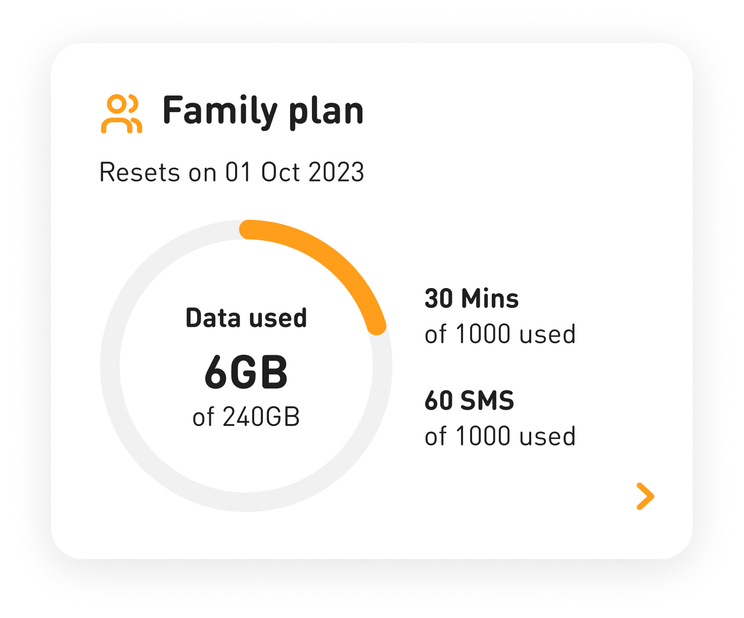
Kept the existing structure but reduced the card height by 30%.
•
Non-plan entitlements were moved into their own card, giving more room to the content below.
•
Minimum impact to current logic.
Stakeholders loved the swipeable cards option more. However, it's parked for now as it required further assessment with tech and budget allocation.
After a year of enhancements
M1+ app NPS moved from
38.5
to an all-time high of
28.3
What’s next
Validating the changes
The redesign was informed by the audit and interviews, but hasn't been tested with users since shipping. Usability testing on the new flows would confirm whether the changes hold up in practice, and catch anything the NPS movement isn’t showing.
Working through the backlog
The prioritisation exercise sorted findings into what we'd fix now, near and far. The rest are still queued and should be picked up as capacity allows.