
Projects
About
M1 Design System
Building an unified design system for consistency and efficiency
A design system built from the ground up across our channels to minimise ambiguities and enhance workflows.
Design Lead
UI Audit
UI/UX
Strategy
Leadership
BACKGROUND
The State Before
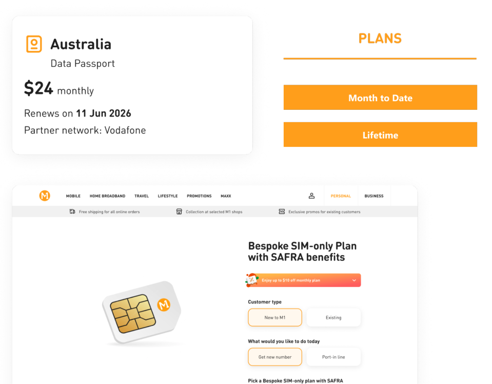
When I first joined the team, I noticed that the designs we shipped out were not governed by an established design system. There was no common foundation across M1's digital products (web, app, sales console and agent console), and design artefacts were scattered across multiple Figma files.
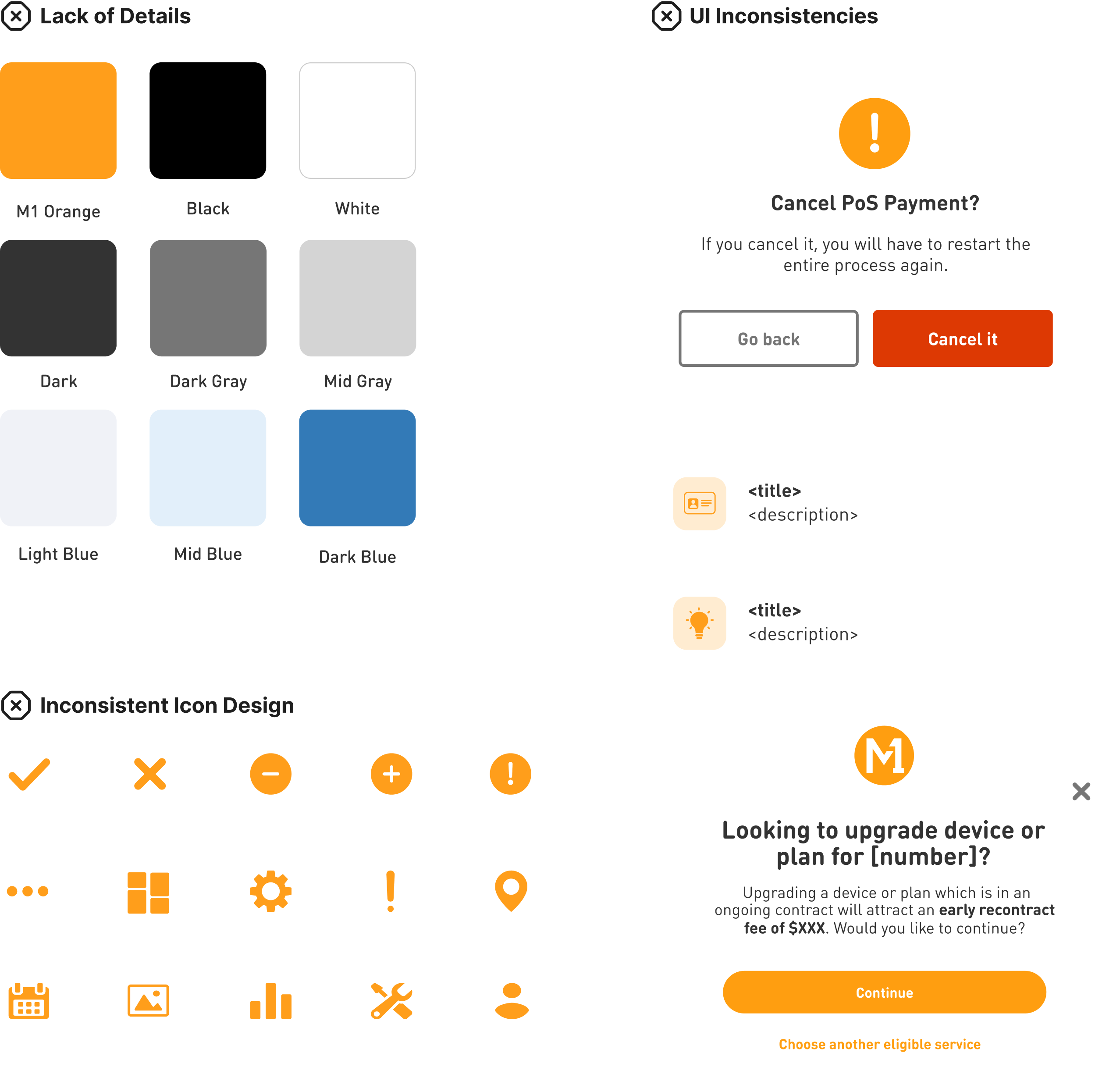
Identified Gaps
- Lack of governance and documentationBespoke components and templates were created without adding them back into the system due to a
- No single source of truth for design
- Fragmentation with inconsistencies surfaced across channels, designers were forced to make guesses about spacing and colour.
- Searching for the latest iteration of our screens for new business requirements was challenging because we had to comb through multiple Figma files to locate them.

The Opportunity
I took the initiative to lead the team in building an unified design system to bring consistency and to provide a shared design language across all four channels (web, app, sales console and agent console).
Research
How Do Others Build Their Design Systems?
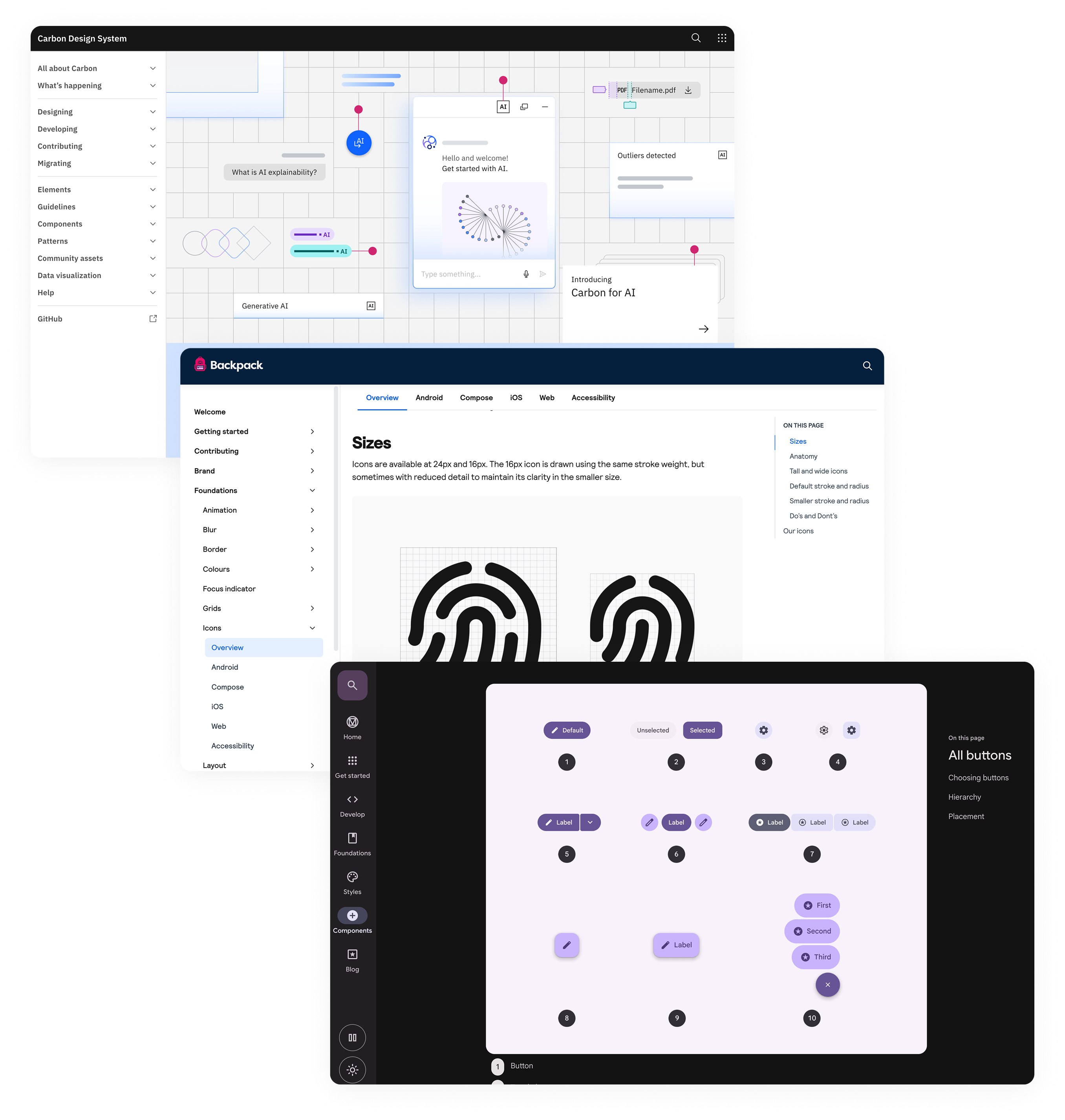
Before jumping straight into building our system, I studied a few established design systems to identify the best practices (i.e. IBM’s Carbon, Google’s Material, Skyscanner’s Backpack and more).
My analysis of the design systems revealed the following key characteristics
Each system cater specifically to their products/use cases
There isn’t “the right way” of building a design system
They are “living” system with tight alignment between design and code
Define
Key Factors to Consider
To make sure my decisions were grounded in the needs and challenges of our team, there were two key factors I needed to take into account.
- Subscribing to a centralised online platform for documentation is not viable due to effort, cost and compliance.
- Design system is new to the team therefore it needs to acquire new knowledge.

Design Decisions
Given the key factors, I made four deliberate decisions to simplify our design system for our specific context.
1
Unify the foundations of the four channels into one
2
Our system will be a layered stop-gate structure
3
Prioritise building
components
4
Create templates as part of our design system
Decision 1/4
Unified Four Channels Foundation Into One
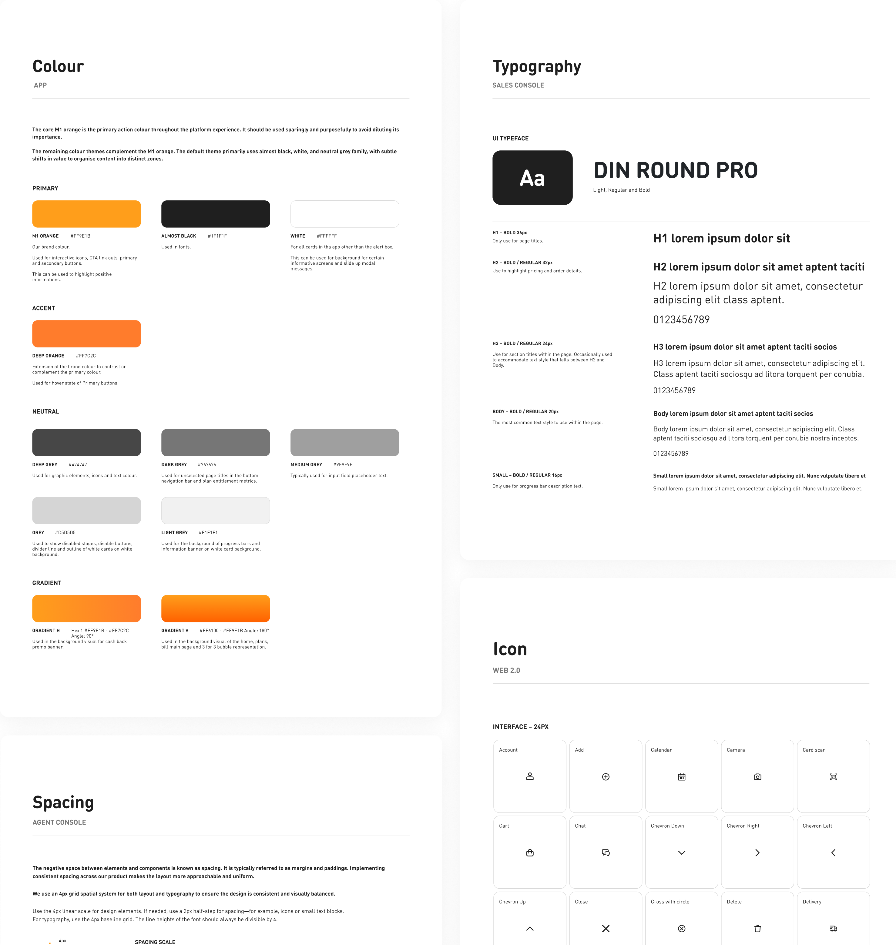
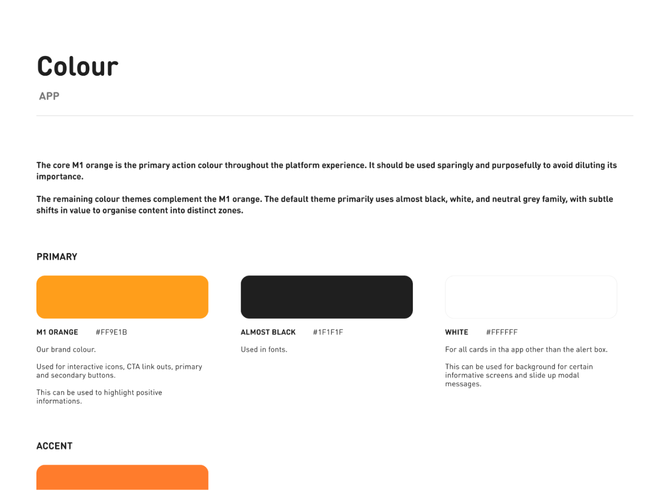
There were overlapping, unique colours, typography scales and spacing used across the four channels. From an efficiency perspective, it was essential to unify them into one shared foundation for the channels.

Why it mattered
As we were a small team, we had to work efficiently. By having a single source of truth for the foundations, it enabled us to quickly implement them. At the same time, it allowed designers to see the value that they add. This helped to remove scepticism and motivated the team to move forward.
Decision 2/4
Built a Layered Stop-Gate Structure
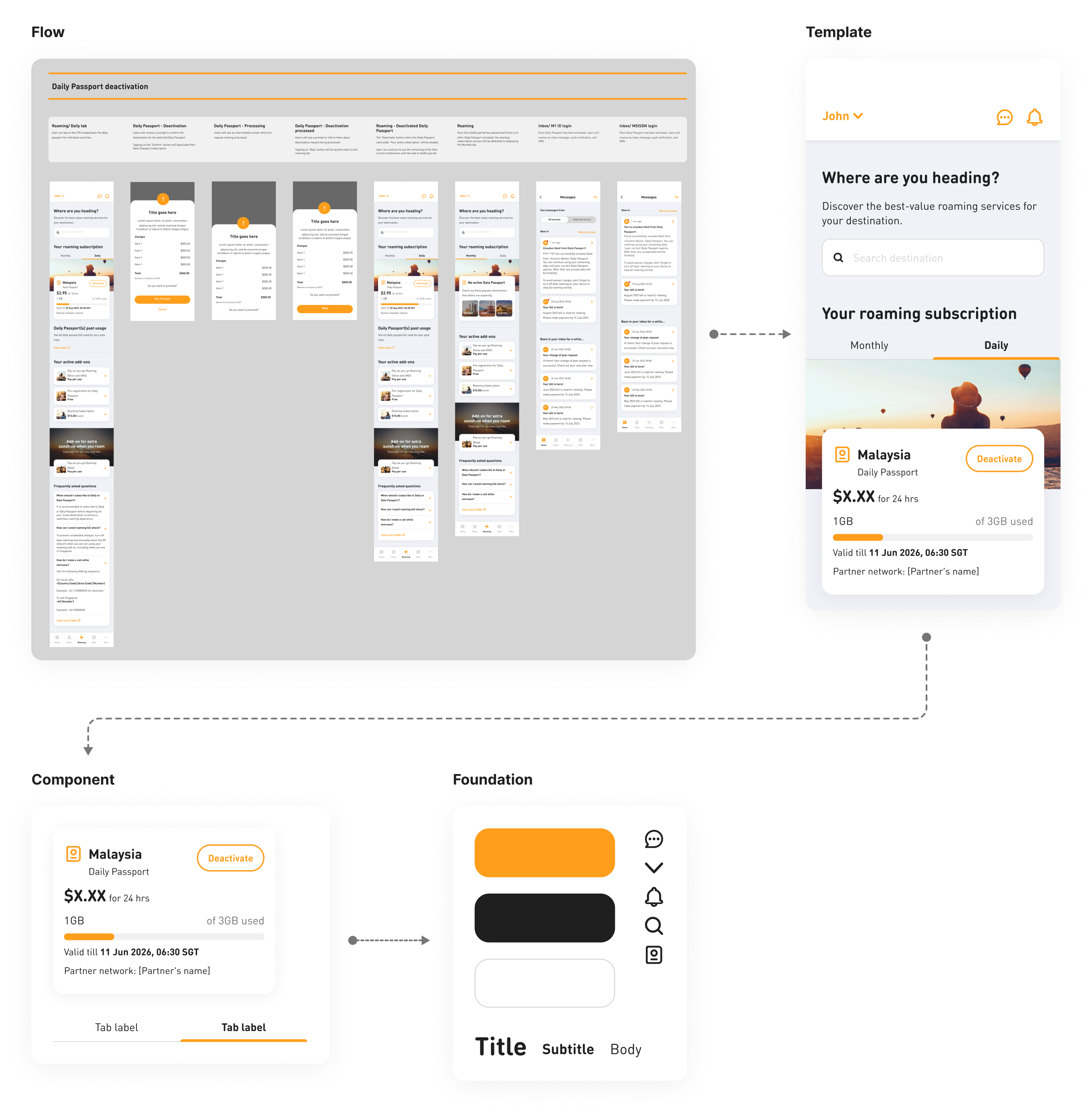
The structure of our design system in Figma was created with four interconnected libraries rather than have all of them in a flat file library. Foundations › Components › Templates › Flows. Each of these libraries linked from the next level down which enable better control when syncing.
Why it mattered
Creating an intended friction when a designer is updating their libraries prevents downstream ripple effect on other dependent files which then forces designers to perform conscious syncs for each update instead of automatically inheriting changes.
Decision 3/4
Prioritised Building the Components
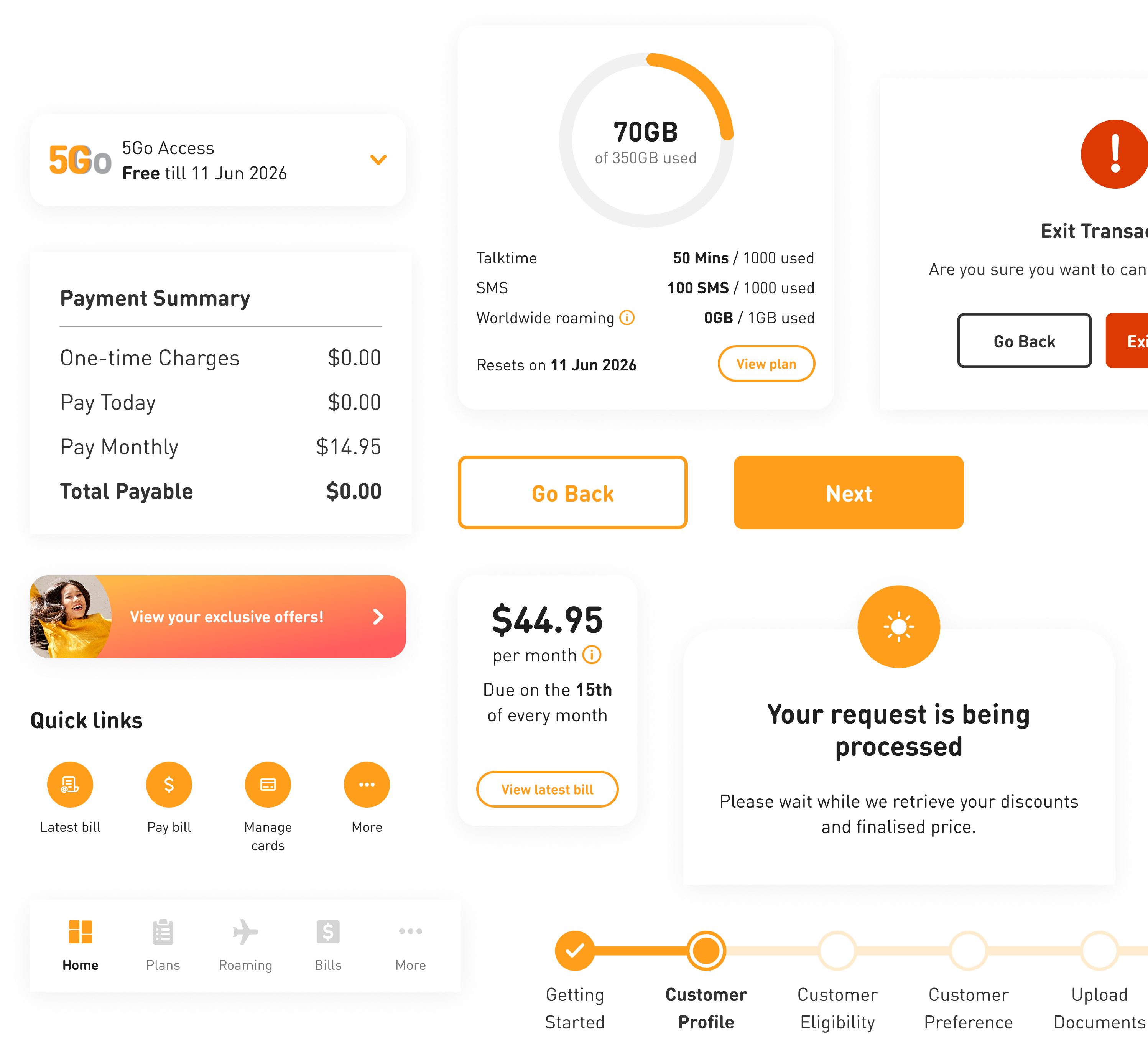
Building components first was based on both our designers’ efficiency and delivery capability. Components are used by all screens, thus providing more rapid and accurate ways for designers to create content. It was a decision that had considered our team’s capacity and short-term delivery goals.
Why it mattered
It provided the opportunity for designers to use them as soon as possible in their daily design workflow. This provided immediate value to designers and allowed for natural adoption within the design team.
Decision 4/4
Created Templates for the User Flows
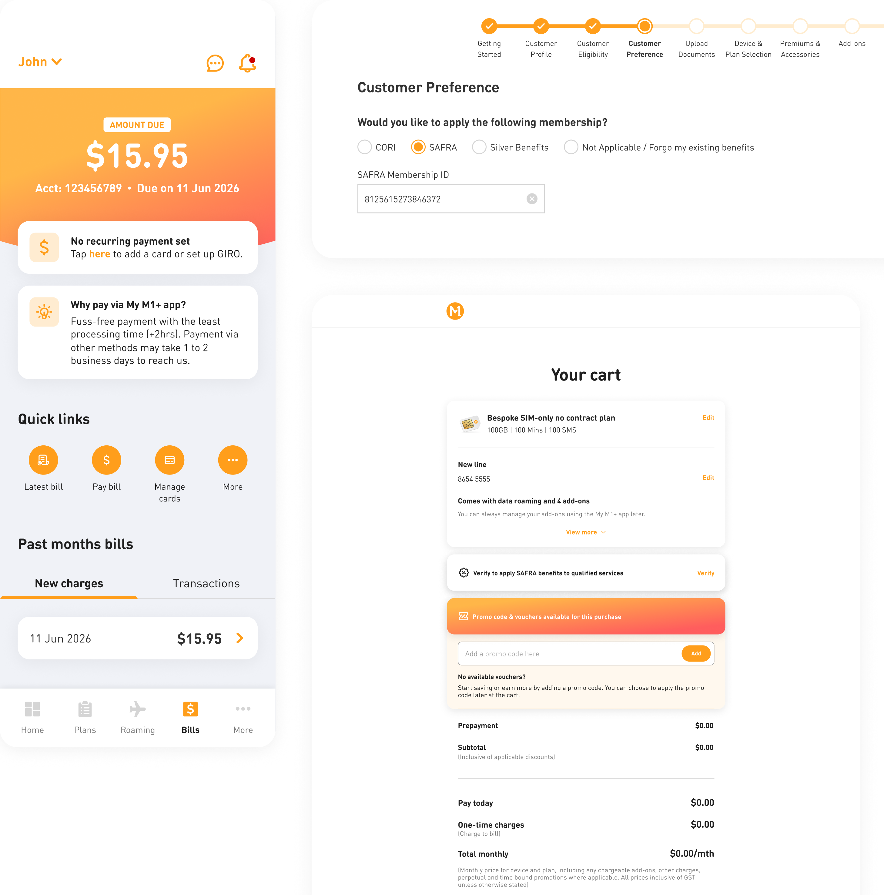
After building the components, we built page templates for all four channels to help them design faster and maintain layout consistency across screens.
Why it mattered
Designers developed pages and flows much faster as they put together the templates for new requirements. Templates provided designers the ability to create a layout consistently and reduced the amount of guessing in terms of layout and spacing requirements. Furthermore, templates also serve as a single source of truth for product owner about the latest design iteration.

What the System Delivered
Our system received positive feedbacks from team members, product owners and tech.It changed how the team designed, collaborated, and shipped work across M1's digital products.
194
components built for four channels
50%
time reduction on design iterations
75%
improvement on new requests
50%
time reduction on knowledge transfer
Artefacts
Foundations
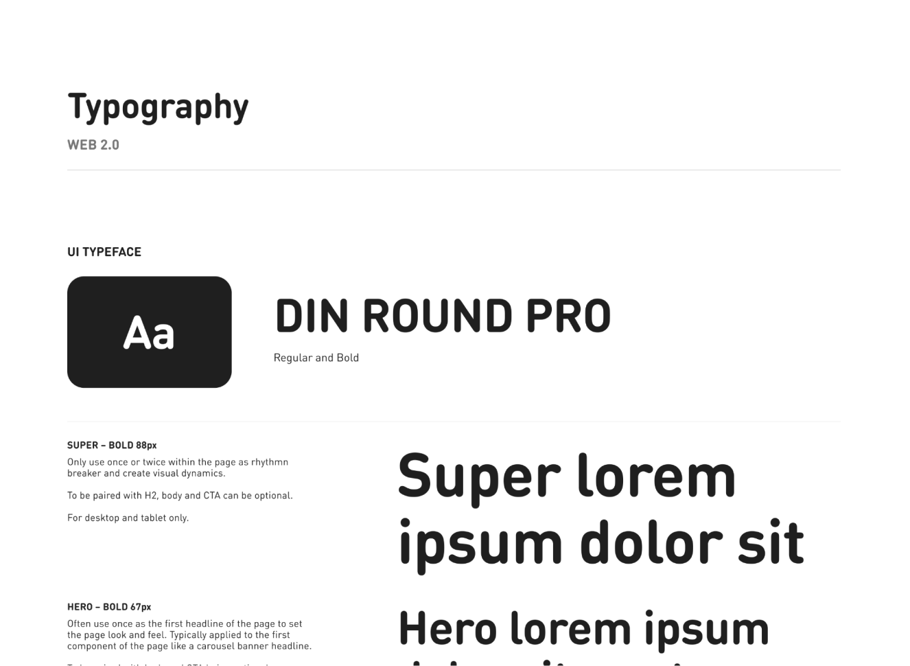
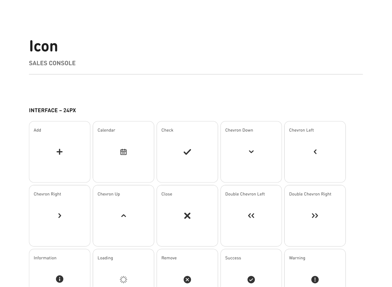
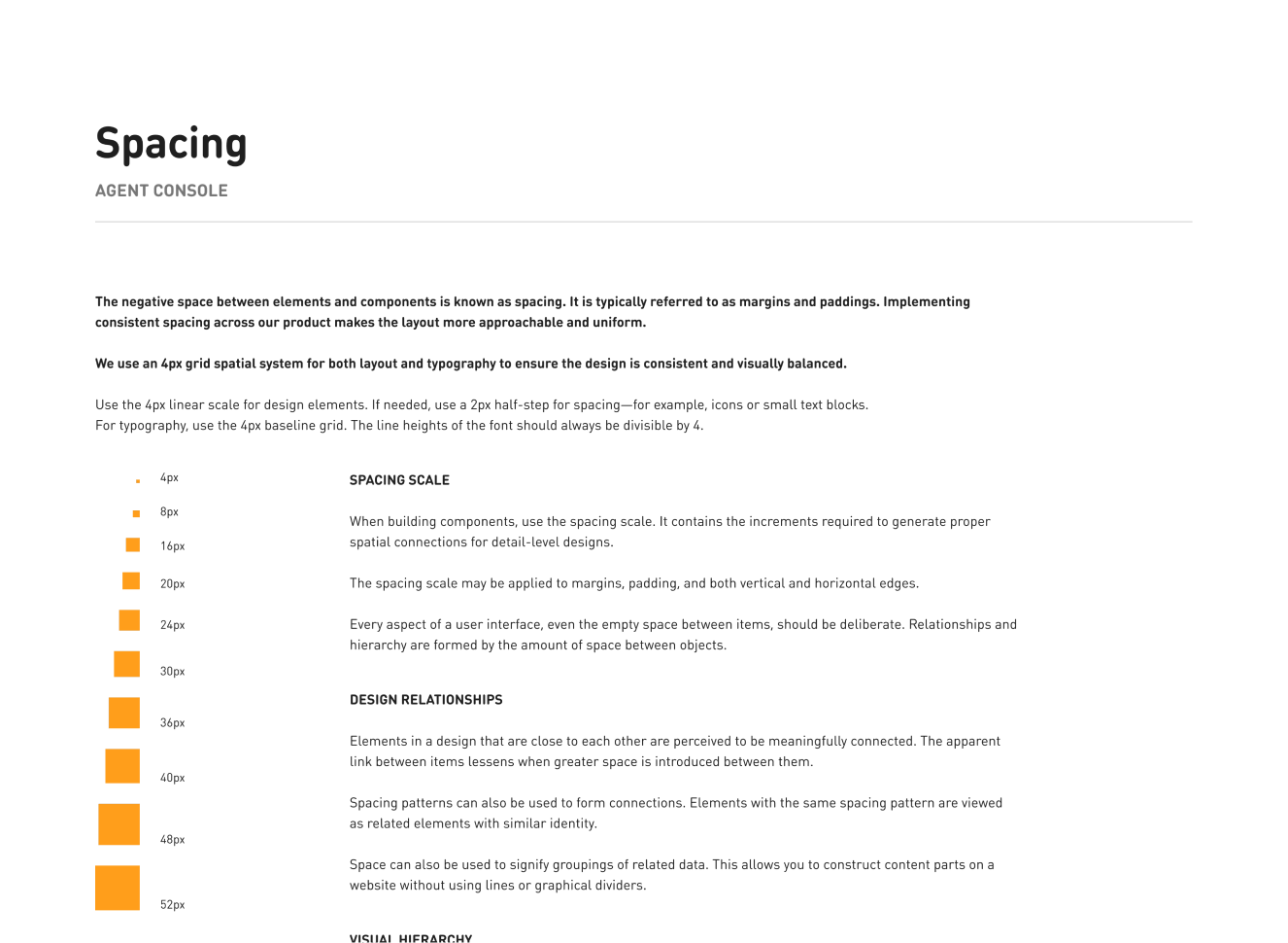
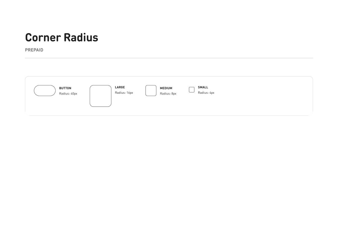
Snippets of the guidelines for iconography, typography, layout, structure and more.
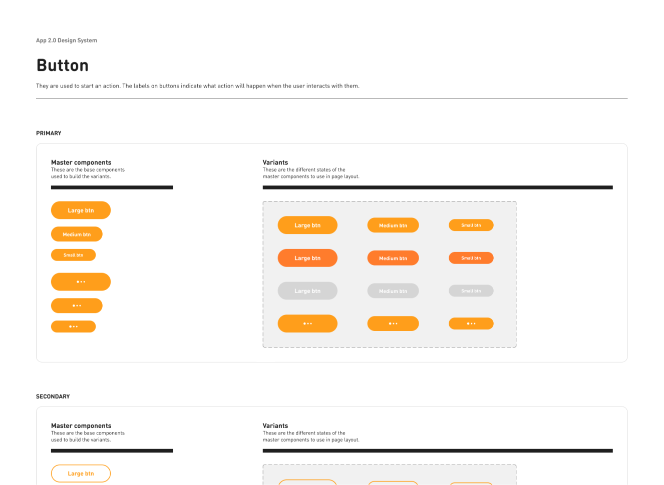
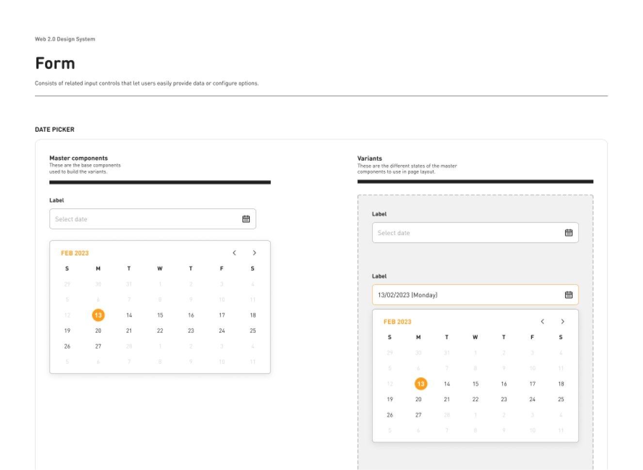
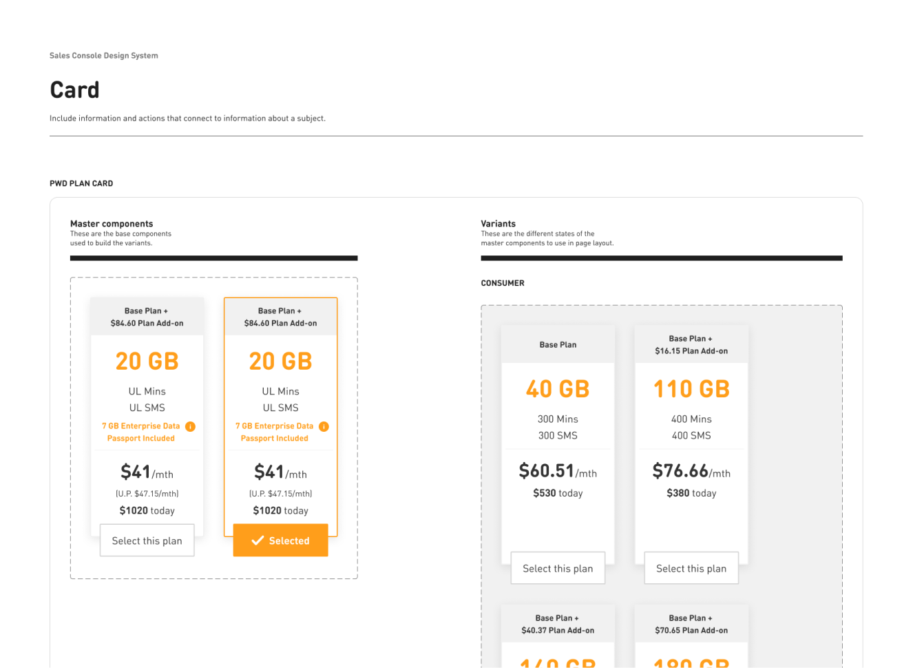
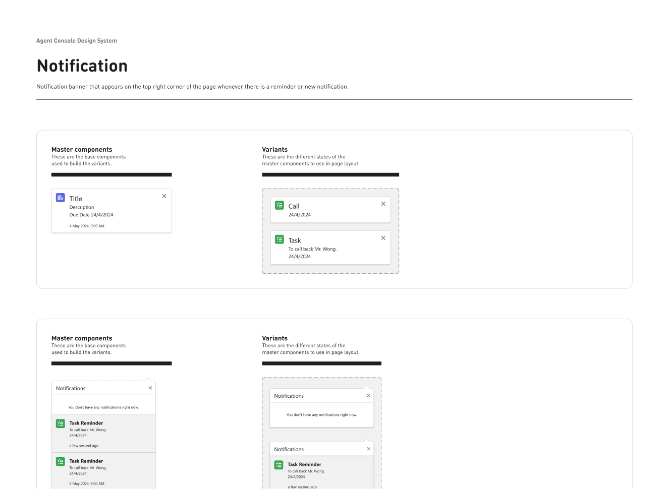
Components
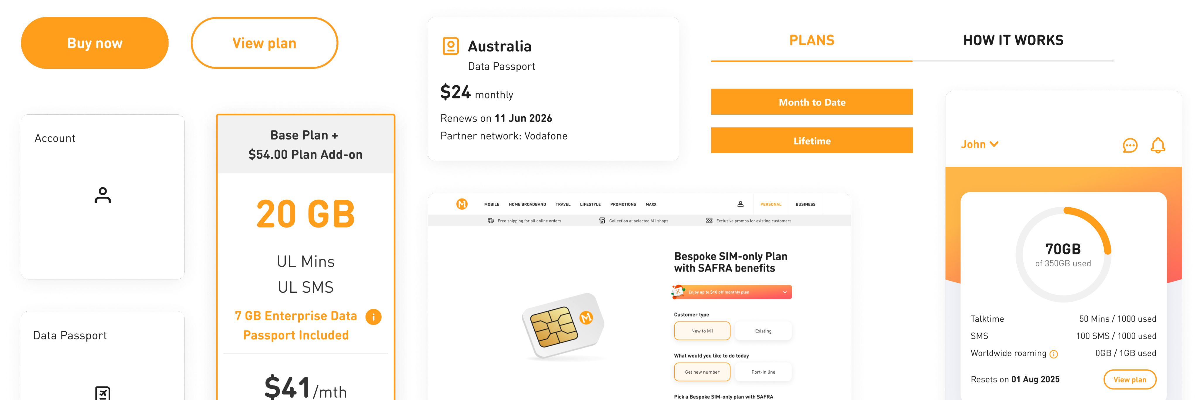
Snippets of the reusable components for our four channels.
Templates
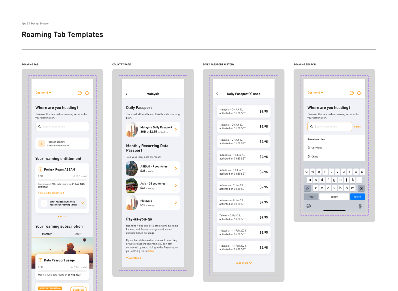
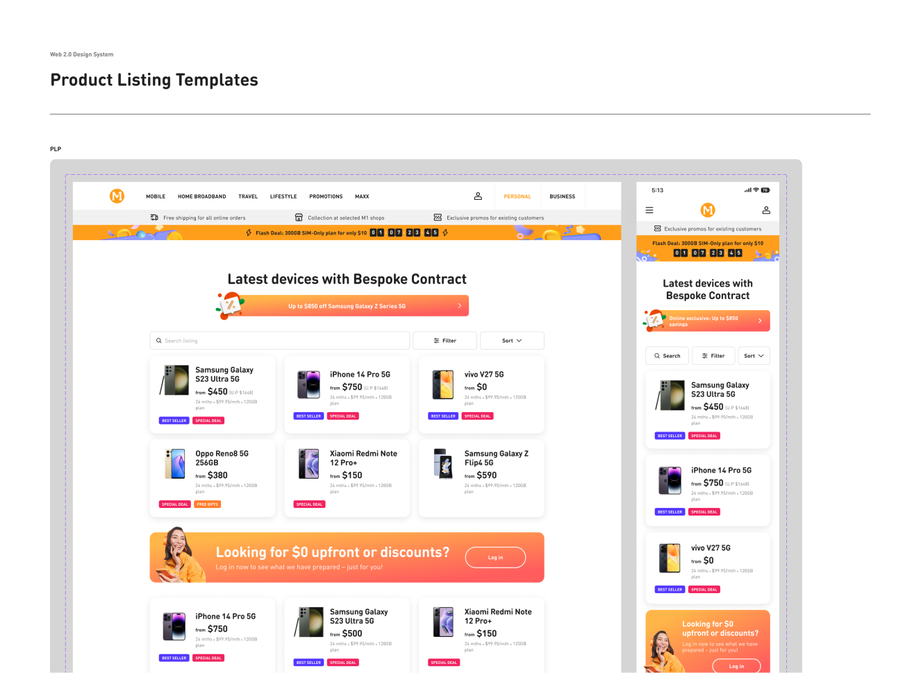
Snippets of the screen templates built for piecing up the user flows.
Governance and Processes
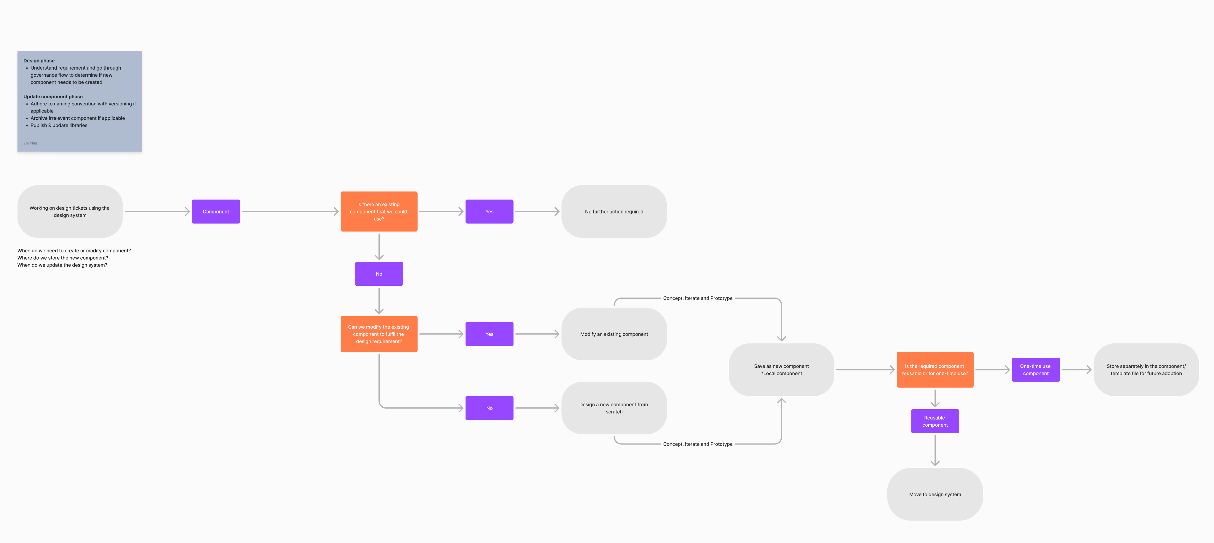
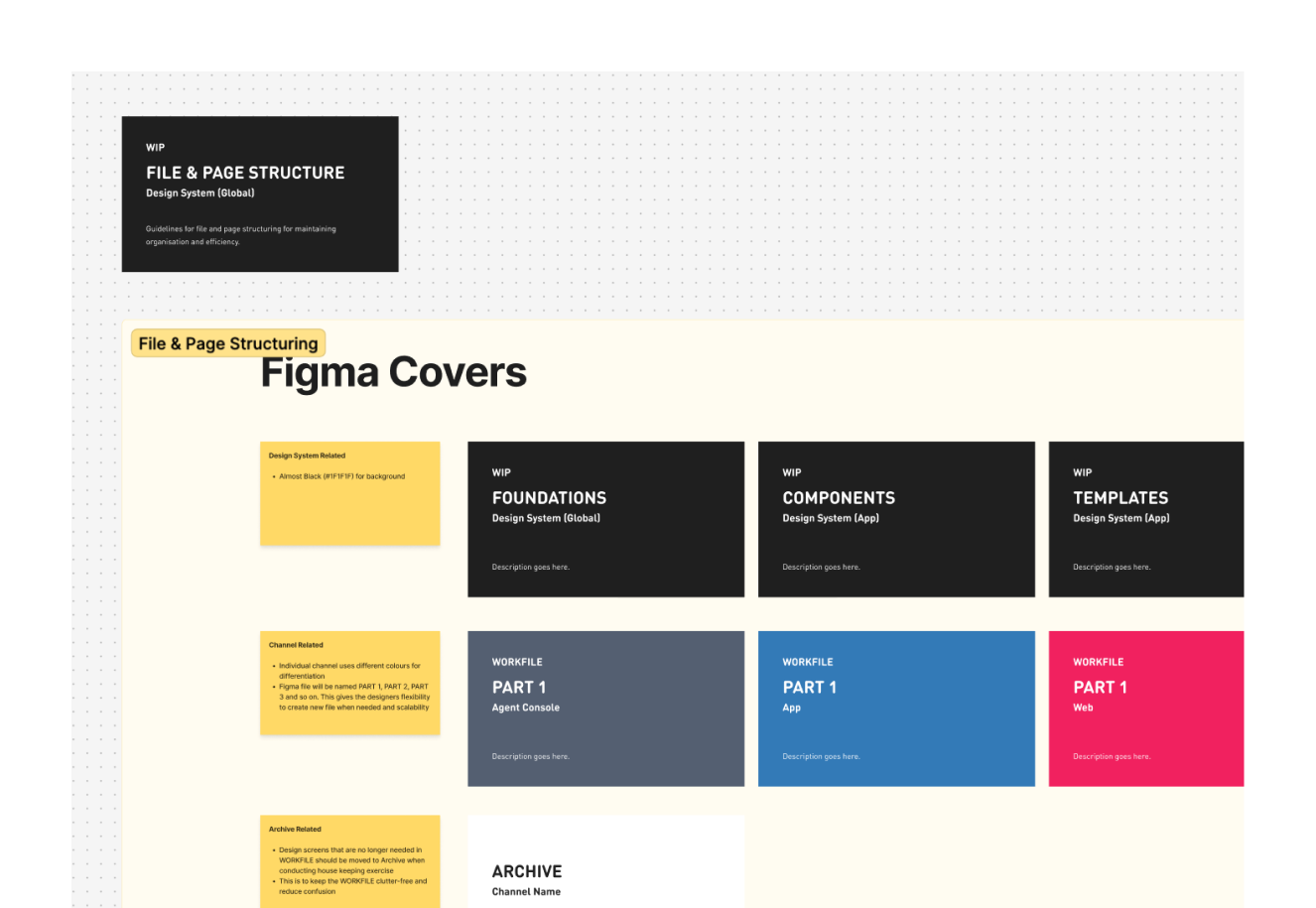
To establish and standardise our working practices.

What Can Be Improved

Enhance documentation
Documentation was another area that required additional focus. More extensive documentation for the template and components could have greatly lessened the uncertainty of the process for new users and increased the efficiency of their introduction into the system.

Roadmap and vision
A single shared roadmap and vision would provide clarity of direction for the whole team. When everyone understands where the system is heading and why, it's easier to make trade-off decisions and bring others along.

Revisit templates
The use of page templates helped as a reference point but at times added rigidness. Designers had to detach the template just so they could test different layout options. Perhaps templates should be less structured than components. New features like Figma Slots may also present opportunities to mitigate this.

Reduce design debt
Separating the design system into its own operational track would also be beneficial. Most of the work within the design system was included as part of the channel's work stream and at times it got deprioritised. Having a dedicated track for the design system ensures that it stays healthy and continues to move forward.
Projects
About
M1 Design System
Building an unified design system for consistency and efficiency
A design system built from the ground up across our channels to minimise ambiguities and enhance workflows.
Design Lead
UI Audit
UI/UX
Strategy
Leadership
BACKGROUND
The State Before
When I first joined the team, I noticed that the designs we shipped out were not governed by an established design system. There was no common foundation across M1's digital products (web, app, sales console and agent console), and design artefacts were scattered across multiple Figma files.
Identified Gaps
- Lack of governance and documentationBespoke components and templates were created without adding them back into the system due to a
- No single source of truth for design
- Fragmentation with inconsistencies surfaced across channels, designers were forced to make guesses about spacing and colour.
- Searching for the latest iteration of our screens for new business requirements was challenging because we had to comb through multiple Figma files to locate them.
The Opportunity
I took the initiative to lead the team in building an unified design system to bring consistency and to provide a shared design language across all four channels (web, app, sales console and agent console).
Research
How Do Others Build Their Design Systems?
Before jumping straight into building our system, I studied a few established design systems to identify the best practices (i.e. IBM’s Carbon, Google’s Material, Skyscanner’s Backpack and more).
My analysis of the design systems revealed the following key characteristics
Each system cater specifically to their products/use cases
There isn’t “the right way” of building a design system
They are “living” system with tight alignment between design and code
Define
Key Factors to Consider
To make sure my decisions were grounded in the needs and challenges of our team, there were two key factors I needed to take into account.
- Subscribing to a centralised online platform for documentation is not viable due to effort, cost and compliance.
- Design system is new to the team therefore it needs to acquire new knowledge.
Design Decisions
Given the key factors, I made four deliberate decisions to simplify our design system for our specific context.
1
Unify the foundations of the four channels into one
2
Our system will be a layered stop-gate structure
3
Prioritise building
components
4
Create templates as part of our design system
Decision 1/4
Unified Four Channels Foundation Into One
There were overlapping, unique colours, typography scales and spacing used across the four channels. From an efficiency perspective, it was essential to unify them into one shared foundation for the channels.
Why it mattered
As we were a small team, we had to work efficiently. By having a single source of truth for the foundations, it enabled us to quickly implement them. At the same time, it allowed designers to see the value that they add. This helped to remove scepticism and motivated the team to move forward.
Decision 2/4
Built a Layered Stop-Gate Structure
The structure of our design system in Figma was created with four interconnected libraries rather than have all of them in a flat file library. Foundations › Components › Templates › Flows. Each of these libraries linked from the next level down which enable better control when syncing.
Why it mattered
Creating an intended friction when a designer is updating their libraries prevents downstream ripple effect on other dependent files which then forces designers to perform conscious syncs for each update instead of automatically inheriting changes.
Decision 3/4
Prioritised Building the Components
Building components first was based on both our designers’ efficiency and delivery capability. Components are used by all screens, thus providing more rapid and accurate ways for designers to create content. It was a decision that had considered our team’s capacity and short-term delivery goals.
Why it mattered
It provided the opportunity for designers to use them as soon as possible in their daily design workflow. This provided immediate value to designers and allowed for natural adoption within the design team.
Decision 4/4
Created Templates for the User Flows
After building the components, we built page templates for all four channels to help them design faster and maintain layout consistency across screens.
Why it mattered
Designers developed pages and flows much faster as they put together the templates for new requirements. Templates provided designers the ability to create a layout consistently and reduced the amount of guessing in terms of layout and spacing requirements. Furthermore, templates also serve as a single source of truth for product owner about the latest design iteration.
What the System Delivered
Our system received positive feedbacks from team members, product owners and tech.It changed how the team designed, collaborated, and shipped work across M1's digital products.
194
components builtfor four channels
50%
time reduction on design iterations
75%
improvement on new requests
50%
time reduction on knowledge transfer
Artefacts
Foundations
Snippets of the guidelines for iconography, typography, layout, structure and more.
Components
Snippets of the reusable components for our four channels.
Templates
Snippets of the screen templates built for piecing up the user flows.
Governance and Processes
To establish and standardise our working practices.

What Can Be Improved
Enhance documentation
Documentation was another area that required additional focus. More extensive documentation for the template and components could have greatly lessened the uncertainty of the process for new users and increased the efficiency of their introduction into the system.
Roadmap and vision
A single shared roadmap and vision would provide clarity of direction for the whole team. When everyone understands where the system is heading and why, it's easier to make trade-off decisions and bring others along.
Revisit templates
The use of page templates helped as a reference point but at times added rigidness. Designers had to detach the template just so they could test different layout options. Perhaps templates should be less structured than components. New features like Figma Slots may also present opportunities to mitigate this.
Reduce design debt
Separating the design system into its own operational track would also be beneficial. Most of the work within the design system was included as part of the channel's work stream and at times it got deprioritised. Having a dedicated track for the design system ensures that it stays healthy and continues to move forward.
Projects
About
M1 Design System
Building an unified design system for consistency and efficiency
A design system built from the ground up across our channels to minimise ambiguities and enhance workflows.
Design Lead
UI Audit
UI/UX
Strategy
Leadership
BACKGROUND
The State Before
When I first joined the team, I noticed that the designs we shipped out were not governed by an established design system. There was no common foundation across M1's digital products (web, app, sales console and agent console), and design artefacts were scattered across multiple Figma files.
Identified Gaps
- Lack of governance and documentationBespoke components and templates were created without adding them back into the system due to a
- No single source of truth for design
- Fragmentation with inconsistencies surfaced across channels, designers were forced to make guesses about spacing and colour.
- Searching for the latest iteration of our screens for new business requirements was challenging because we had to comb through multiple Figma files to locate them.
The Opportunity
I took the initiative to lead the team in building an unified design system to bring consistency and to provide a shared design language across all four channels (web, app, sales console and agent console).
Research
How Do Others Build Their Design Systems?
Before jumping straight into building our system, I studied a few established design systems to identify the best practices (i.e. IBM’s Carbon, Google’s Material, Skyscanner’s Backpack and more).
My analysis of the design systems revealed the following key characteristics
Each system cater specifically to their products/use cases
There isn’t “the right way” of building a design system
They are “living” system with tight alignment between design and code
Define
Key Factors to Consider
To make sure my decisions were grounded in the needs and challenges of our team, there were two key factors I needed to take into account.
- Subscribing to a centralised online platform for documentation is not viable due to effort, cost and compliance.
- Design system is new to the team therefore it needs to acquire new knowledge.

Design Decisions
Given the key factors, I made four deliberate decisions to simplify our design system for our specific context.
1
Unify the foundations of the four channels into one
2
Our system will be a layered stop-gate structure
3
Prioritise building
components
4
Create templates as part of our design system
Decision 1/4
Unified Four Channels Foundation Into One
There were overlapping, unique colours, typography scales and spacing used across the four channels. From an efficiency perspective, it was essential to unify them into one shared foundation for the channels.
Why it mattered
As we were a small team, we had to work efficiently. By having a single source of truth for the foundations, it enabled us to quickly implement them. At the same time, it allowed designers to see the value that they add. This helped to remove scepticism and motivated the team to move forward.
Decision 2/4
Built a Layered Stop-Gate Structure
The structure of our design system in Figma was created with four interconnected libraries rather than have all of them in a flat file library. Foundations › Components › Templates › Flows. Each of these libraries linked from the next level down which enable better control when syncing.
Why it mattered
Creating an intended friction when a designer is updating their libraries prevents downstream ripple effect on other dependent files which then forces designers to perform conscious syncs for each update instead of automatically inheriting changes.
Decision 3/4
Prioritised Building the Components
Building components first was based on both our designers’ efficiency and delivery capability. Components are used by all screens, thus providing more rapid and accurate ways for designers to create content. It was a decision that had considered our team’s capacity and short-term delivery goals.
Why it mattered
It provided the opportunity for designers to use them as soon as possible in their daily design workflow. This provided immediate value to designers and allowed for natural adoption within the design team.
Decision 4/4
Created Templates for the User Flows
After building the components, we built page templates for all four channels to help them design faster and maintain layout consistency across screens.
Why it mattered
Designers developed pages and flows much faster as they put together the templates for new requirements. Templates provided designers the ability to create a layout consistently and reduced the amount of guessing in terms of layout and spacing requirements. Furthermore, templates also serve as a single source of truth for product owner about the latest design iteration.

What the System Delivered
Our system received positive feedbacks from team members, product owners and tech.It changed how the team designed, collaborated, and shipped work across M1's digital products.
194
components builtfor four channels
50%
time reduction on design iterations
75%
improvement on new requests
50%
time reduction on knowledge transfer
Artefacts
Foundations
Snippets of the guidelines for iconography, typography, layout, structure and more.
Components
Snippets of the reusable components for our four channels.
Templates
Snippets of the screen templates built for piecing up the user flows.
Governance and Processes
To establish and standardise our working practices.
What Can Be Improved
Enhance documentation
Documentation was another area that required additional focus. More extensive documentation for the template and components could have greatly lessened the uncertainty of the process for new users and increased the efficiency of their introduction into the system.

Roadmap and vision
A single shared roadmap and vision would provide clarity of direction for the whole team. When everyone understands where the system is heading and why, it's easier to make trade-off decisions and bring others along.
Revisit templates
The use of page templates helped as a reference point but at times added rigidness. Designers had to detach the template just so they could test different layout options. Perhaps templates should be less structured than components. New features like Figma Slots may also present opportunities to mitigate this.
Reduce design debt
Separating the design system into its own operational track would also be beneficial. Most of the work within the design system was included as part of the channel's work stream and at times it got deprioritised. Having a dedicated track for the design system ensures that it stays healthy and continues to move forward.